The Squirrel Sisters are back at it and happy to bring you another mini hop! For those new to us, we’re a small group of crafty friends that decided to challenge ourselves to use all the supplies we’ve squirreled away, and each time we pick a theme to inspire us. This time, we opted to make cards for our favorite holiday. Now, it wasn’t until after I made my Christmas projects that I realized I could have made cards for Squirrel Appreciation Day, January 21st. Doh! Missed opportunity!!! 😅 Before I share my cards, take a quick look at the hop list to make sure you visit the other Squirrels and see their holiday creations!
I truly had a hard time picking a favorite holiday because I’m such a sucker for all holidays and have fond memories of when my son was little, making each holiday special for him. Given its July, I wanted to do a 4th of July card because I’m also crazy patriotic, but sadly I lacked the supplies to do it justice. And I certainly don’t lack Christmas supplies!! 🤣 I believe I could honestly make a Christmas card every single day for a year and not use the same thing twice, so Christmas it is!!! That said, its been a hella week, so my cards are simple and understated. Have a look:
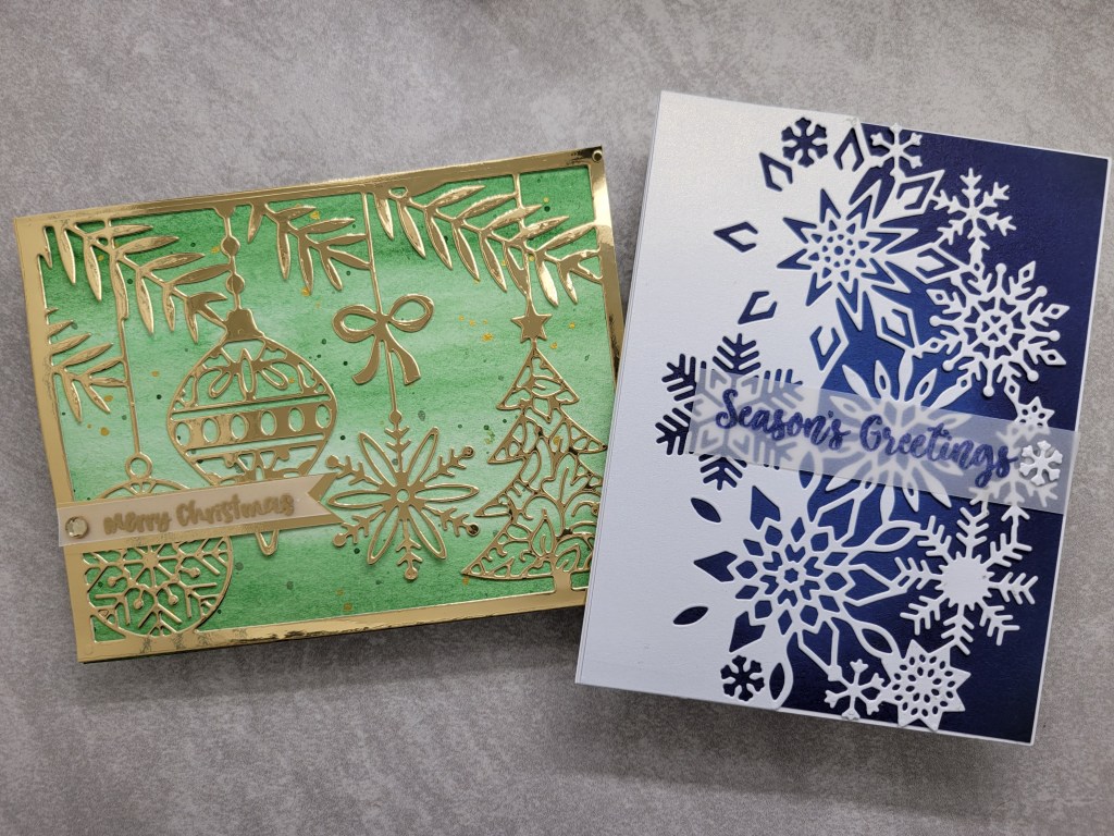
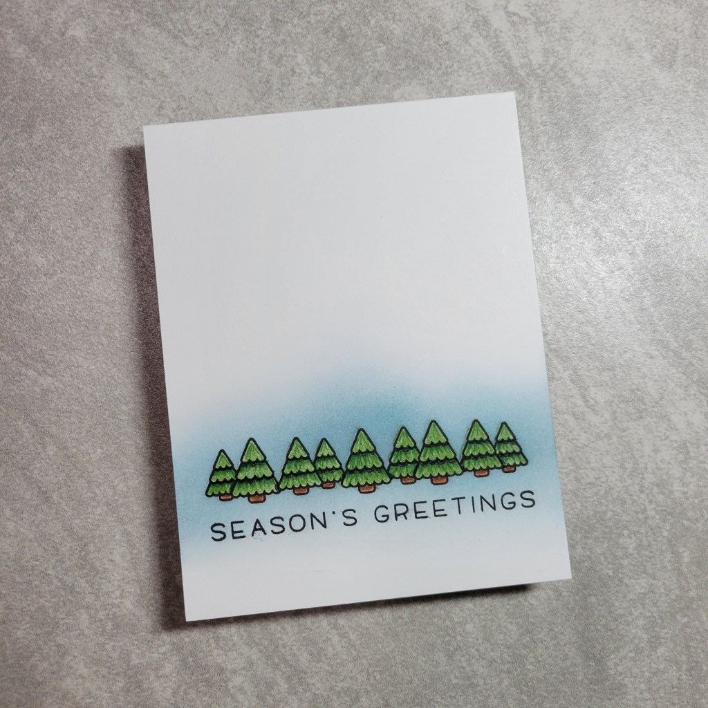
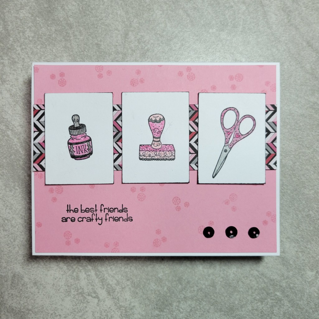
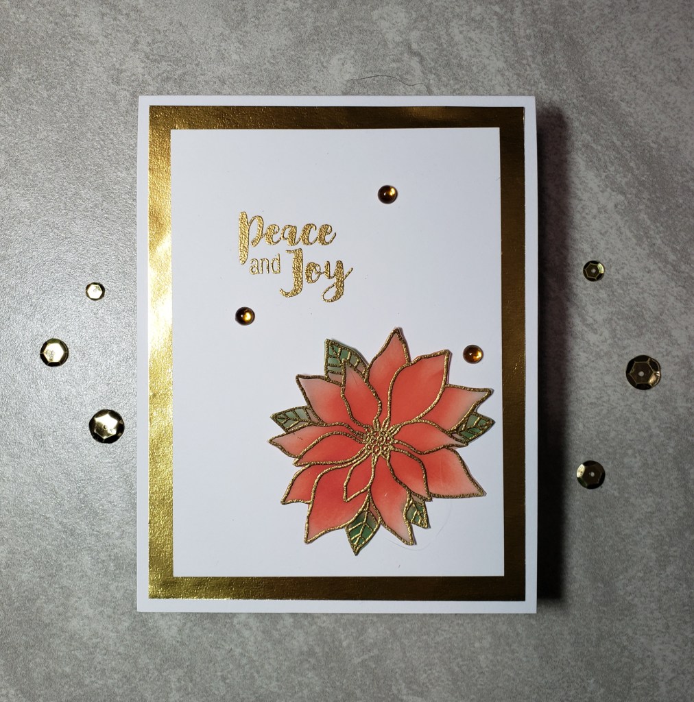
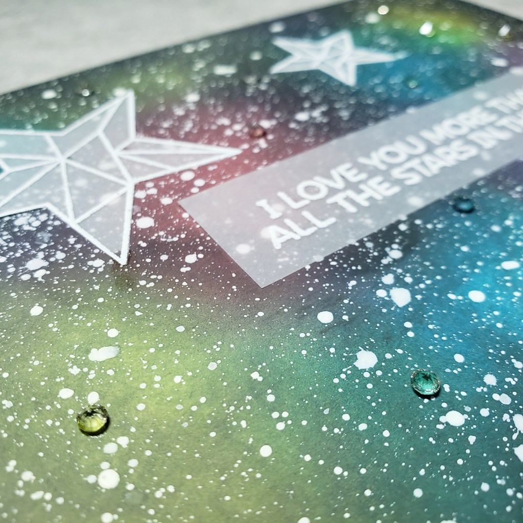
A couple years ago, Hobby Lobby put a bunch of their stamps and dies on clearance and I scored some great stuff at a great price. In that haul, I picked up several Momenta cover plates for $4 each. I thought these would be a great starting point for quick cards. I dug through my stash of scraps to use some specialty papers to make these simple cards more special. My favorite of the 2 is this ornament card:
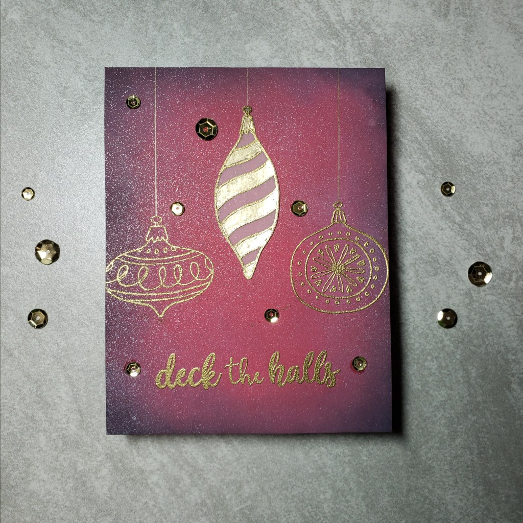
The die was cut from gold foil paper. Somewhere in my craft room is an entire 12×12 pad of printed watercolor designs, but for the life of me I could not find it, so I made my own! I pulled out my Gansai Tambi watercolor paints and made a background complete with green and gold splatters. Now, this design doesn’t allow a whole lot of room for a sentiment on the front, so I used a small sentiment from Jane’s Doodles Winter Village set to stamp and heat emboss on vellum. I added a foil mat to the vellum to make the sentiment more legible, and used a gold gem to hide the glue dot holding it all together. It probably took longer for the watercolor paper to dry than it did to make the rest of the card. I had originally tried another Jane’s Doodles sentiment from a set called Deck the Halls, but it was too big for the card front, so I added it to the inside, and added a few paint splatters to tie it in. Now for my 2nd card:
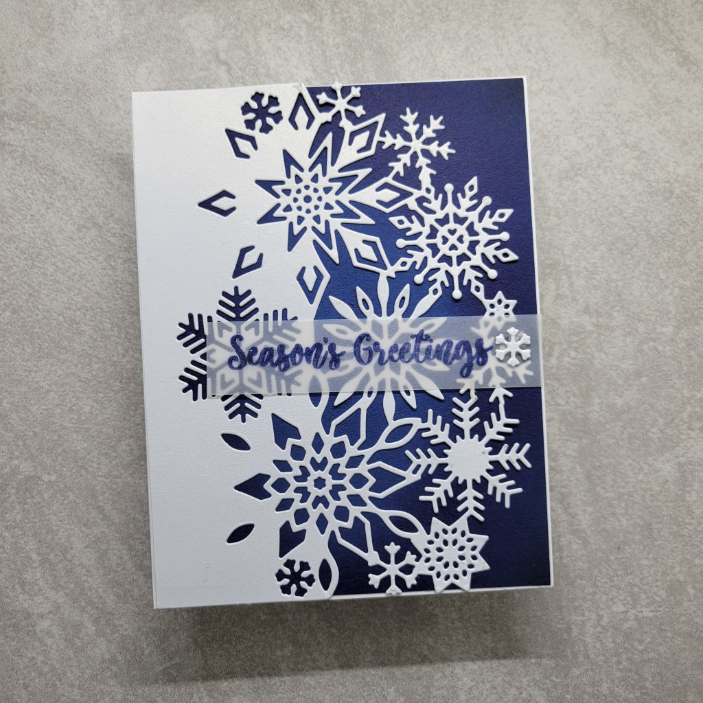
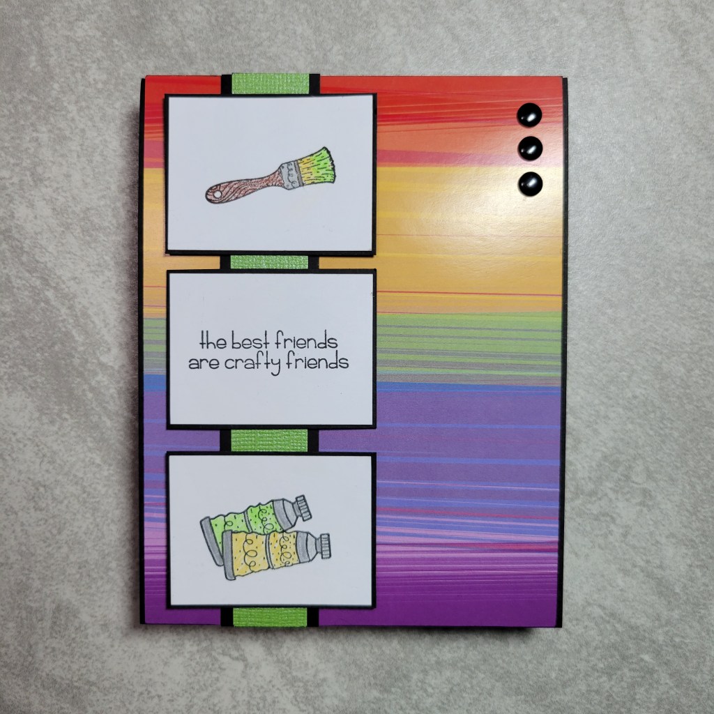
This die was cut from a pearl shimmer paper. I auditioned a glitter paper for the background but it just competed so I settled for plain blue cardstock, but to snazz it up some I used Distress Oxides to ink a highlight in the middle, and then inked the edge darker, like a vignette. It’s subtle, and the camera doesn’t pick it up well but it is noticeable in real life. Once again, I turned to my enormous stash of Jane’s Doodles sets and this time picked a sentiment from Driving Home For Christmas. This was stamped in Distress Oxide Chipped Sapphire and was also heat embossed. I felt like a mat didn’t help the sentiment this time, so I adhered the vellum straight to the card front, using one of the snowflakes the cover die creates to embellish and hide my glue dot. This cover die would be beautiful in a white glitter paper or flocked paper, but I couldn’t put my hands on those either! I really need to spend some time reorganizing my supplies!!! LOL
OK, so you should have arrived here from V’s blog, Passions and Distractions, and your next stop is Marie of Another Card Maker?, who unabashedly loves Christmas, so you will likely get more Christmas in July inspiration there! I can’t wait to see the other Squirrel’s creations!!! Thanks for stopping by, and before you leave drop me a comment to tell me what type of holiday cards you love to make!
Welcome back to another gathering of everyone’s favorite crafty squirrels! (There’s a sentence you never thought you’d hear, right?) We are digging through our stash of supplies we’ve squirreled away and challenging ourselves to use something old… well, at least 2 years old. Now, to be honest, most of my stash is wwwwwaaaaayyyyy older than that, and I could have chosen almost anything and still met the 2 year requirement, but for my Squirrel Sisters who buy supplies more frequently (looking at you, Marie and Lounon!), old to them is 2 years or more. They would probably consider my stash to be “moldy oldies” 😅 OK, so before I show you my card, let me give you the short hop list so you know where to go from here. And if you are coming to my blog from the charming V Fairchild’s blog, Passions and Distractions, I welcome you!
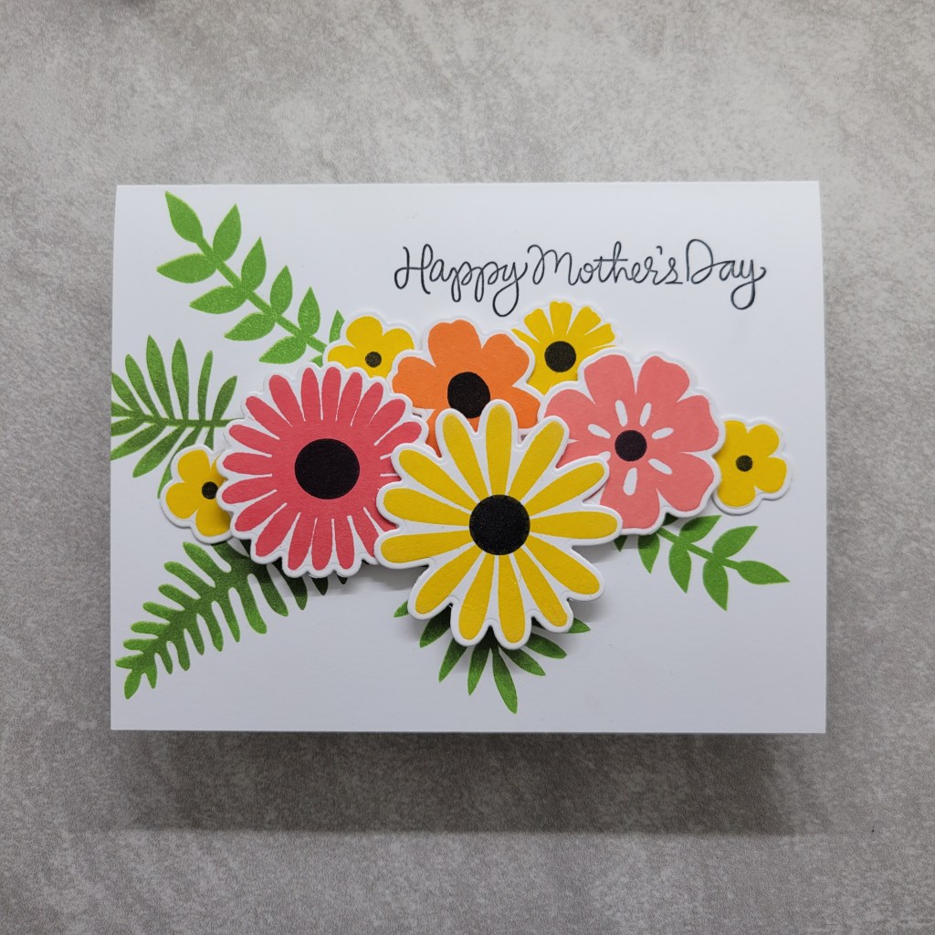
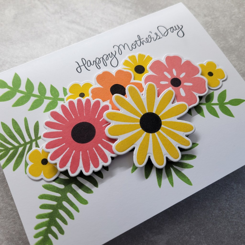
You don’t have to be a regular around here to know that I struggle to find creative mojo 😉. This month was no exception. I plopped down at my desk with no idea where to start. I keep a stash of bits and bobs that I’ve started and not finished, or used to audition on other cards. I started by digging through that stash trying to find a spark of inspiration.
Low and behold a card base stamped with fern leaves grabbed my attention. I remember starting this card front for a hop we did where the theme was stitching because I was going to stitch flowers to add to it and ran out of time. (I went back to see when that was… August of 2021, so even this pre-started card base is over 2 years old! LOL!) I wasn’t in the mood to stitch this time, so I had to find a new direction. The fern images are from a My Favorite Things set called Large Desert Bouquet (circa 2019). I picked a color palette of Distress Oxide inks in Festive Berries, Abandoned Coral, Ripe Persimmon, and Squeezed Lemonade (all of which are at least 2 years old too). My best guess is that the leaves were stamped in Mowed Lawn and Evergreen Bough. I stamped out the flowers from the same MFT Large Desert Bouqet set, and die cut them with the coordinating dies. I went back in and stamped flower centers in black Versaclair ink. Despite waiting 24 hours in between stamping, the black still faded back to a brownish IRL, which is frustrating. I found a Mother’s Day sentiment from a Simon Says Stamp set called Best Mom Ever (circa 2016).
After futzing with the flower arrangement and sentiment, I stamped the sentiment direct on the card base and then layered up the flowers with various thicknesses of foam tape for dimension. All things considered it was an easy card, but being so rusty at crafting, it took longer than I care to admit to! Here’s a look at all that dimension:
This card is headed to my bestie, because it was due to her being an awesome mom to her daughter that we even met and became friends! OK, so now its time for you to hop on over to my dear friend Marie’s blog (I assure you, she’s not just Another Card Maker 😉) to see what she whipped up for you! Her cards always inspire me!!! With only 5 stops in the hop, you should be able to hop on through in no time, and that’s even with leaving us each some comment love along the way! Thank you so much for stopping by and I hope we inspire you to dig through your crafty stash of old supplies to make something too!
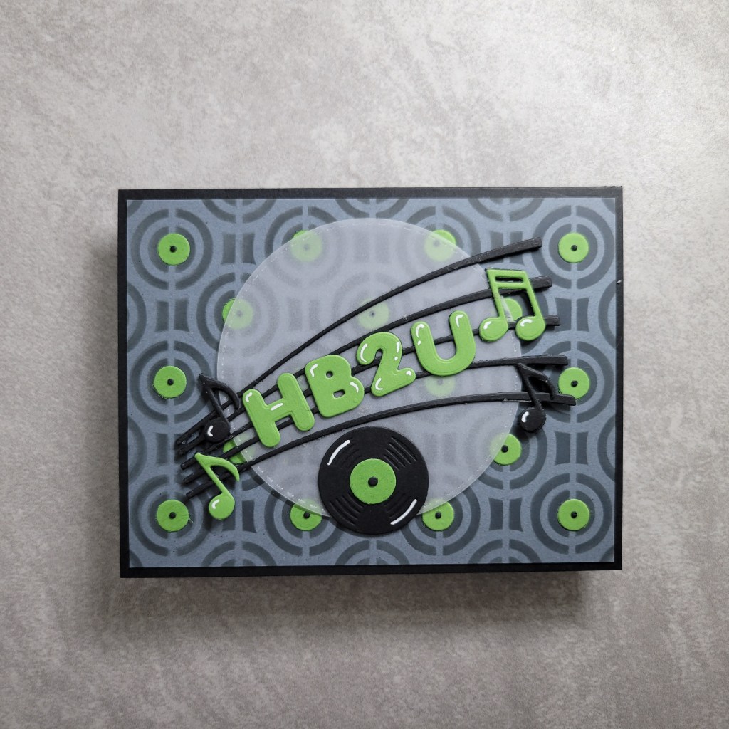
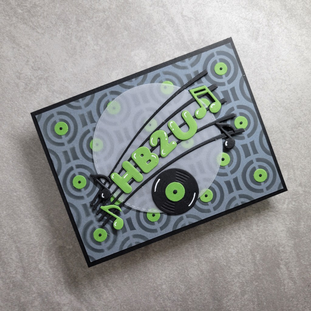
Yikes! Its been awhile since I had reason to pop in here but I’m happy to announce that my Squirrel Sisters and I are continuing our hops to encourage us to use all those supplies we have squirreled away! This year we are trying to make it easier on ourselves with prompts that aren’t too stringent and to focus on using supplies that have never been used before. That was easy for me to pick because the only crafty purchases I made last year were on Black Friday, and it was all still in a pile to be added to my Evernote inventory. While I didn’t buy much, I scored a Waffle Flower grip mat which I *knew* I had to use for this card. I grabbed a new stencil and got to work! Have a look at what I came up with:
My inspiration was making a birthday card for my son whose favorite colors are lime, black and gray/silver. Digging through the new-to-me supplies, I saw a few things I got from Stamp Anniething. The HB2U die set got me thinking about other music related supplies I have and got my wheels turning (You spin me right ’round baby right ’round, like a record baby, right ’round ’round ’round… sorry, not sorry). From there I looked at my new stencils and the one called Retro Circles, also from Stamp Anniething, made me think of record albums. Now once I stenciled Black Soot Distress Oxide through the stencil, I realized I was going to need labels to make the circles look like records. Also in the bin of new supplies was a cover die from Gina Marie Designs called Polka Dot Background Plate, which die cuts a bunch of circles within a frame that reminds me of swiss cheese, but it was the die cut circles I needed. I used paper scraps to cut a whole bunch of the smallest circles to make the labels. Then it looked weird without the hole in the center, and I didn’t trust myself to do it with a pen, so I dug through my older stash for something that would make tiny holes. I found the Halftone cover die from Altenew and cut a bunch all at once, though the time I save in die cutting I lost in gluing on all those teeny tiny dots! Of course I die cut the HB2U with the layers and music notes, but it was getting lost on the busy background. I checked my stash of previously cut shapes to use as a mat and found a stitched circle cut from vellum, which was perfect to help the sentiment pop without covering too much of that background I spent so much time on. I die cut an extra HB2U to glue underneath the vellum to help it pop off the background even more. But I felt like I needed something else. A quick search of my Evernote inventory showed a fun die set I had never used before, this one from Spellbinders, called Sing It Loud 2 that had a record die! I totally forgot I owned this 🤦♀️ but thank goodness for Evernote or else I’d have never remembered to use it! Also in inventory with a music theme was a stamp set by My Favorite Things called Keep On Rockin’, and to my credit I HAD actually used the heck out of this set when my son was younger. We made cards for every instructor he had for drum lessons, every school music teacher, marching band director, symphony director, and venue manager where his rock band played. Now it is finally getting used for the inside sentiment on his birthday card. I had an extra scrap of the stenciled background, so I added that to the inside to carry the theme, as well as another record. To give the card a final touch, I added white gel pen on the puffy looking sentiment to make them appear more dimensional, and to the records and music notes. I thought about adding Glossy Accents or Wink of Stella, but had to remind myself that the card was for a 23 year old boy. IYKYK.
Hopefully I didn’t lose you in all of that rambling (and singing), because there is way more fun to be had by hopping along and visiting the other Squirrel Sisters to see what goodies they chose to play with for the hop! There’s just 5 of us, so it won’t take you long and by the end you should be running to your craft rooms to break out *your* newest supply!!!
Thanks for dropping by and be sure to head to Lounon’s blog, Craft Me, Craft Moi, and prepare to be wow’d! And if you didn’t arrive here by way of Anna’s blog, Crafty Anna Studio, make sure you go all the around the hop cause you do not want to miss seeing her creation!!!
Well howdy, folks! I hope you enjoyed your summer while we took a break from Bashing our Stash of crafty supplies these last couple months. For those of you who have no idea what the heck I’m talking about, my friends (affectionately called the Squirrel Sisters) formed this group to encourage and challenge each other to use the supplies we have squirreled away 😉 and neglected. We pick a theme for the month and then either a technique or supply type as further inspiration. For September we’re doing Anniversary cards and the supply is embossing folders! Now, we took a couple months off to enjoy all the things that summer brings but are itching to get back to it. So have a look at what I came up with:
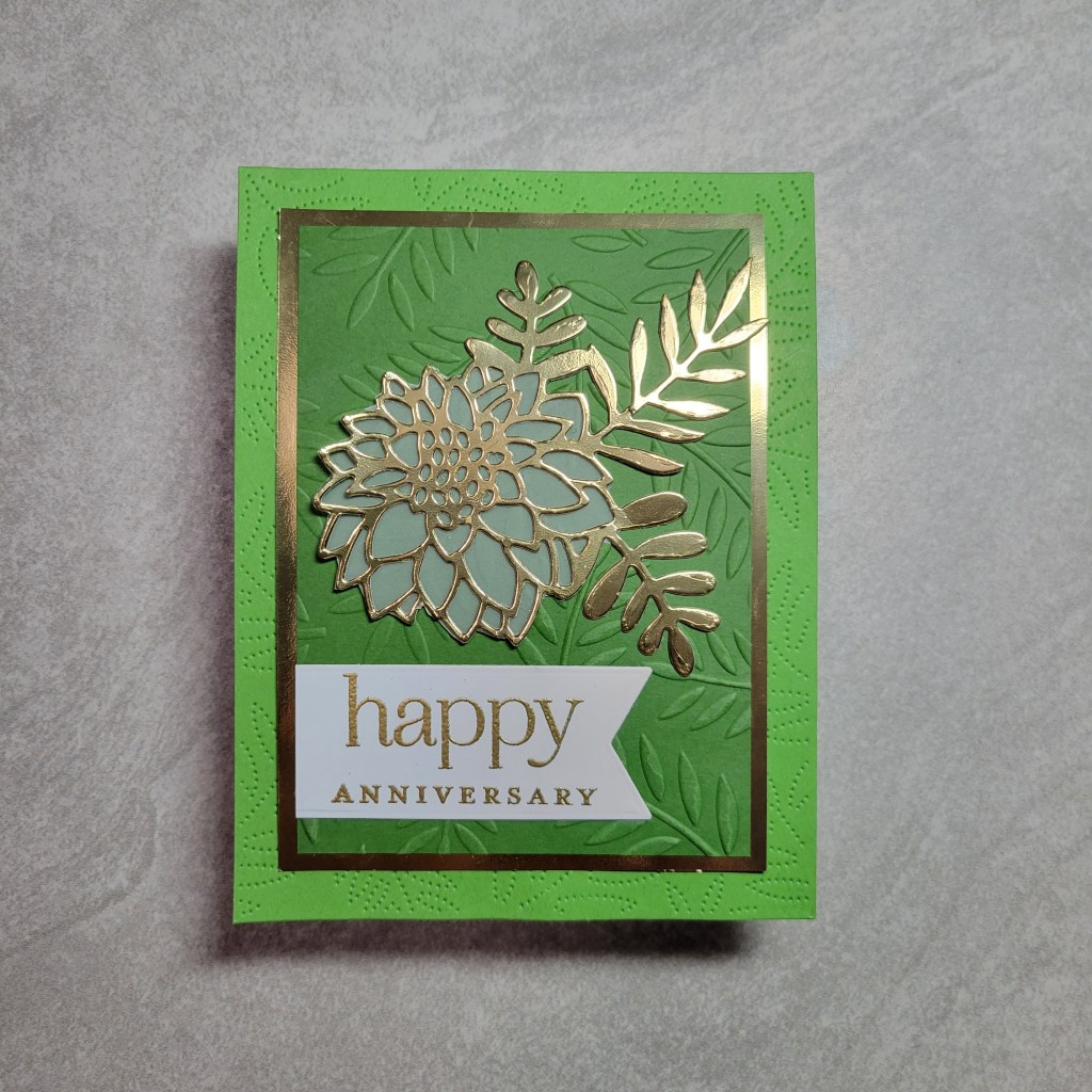
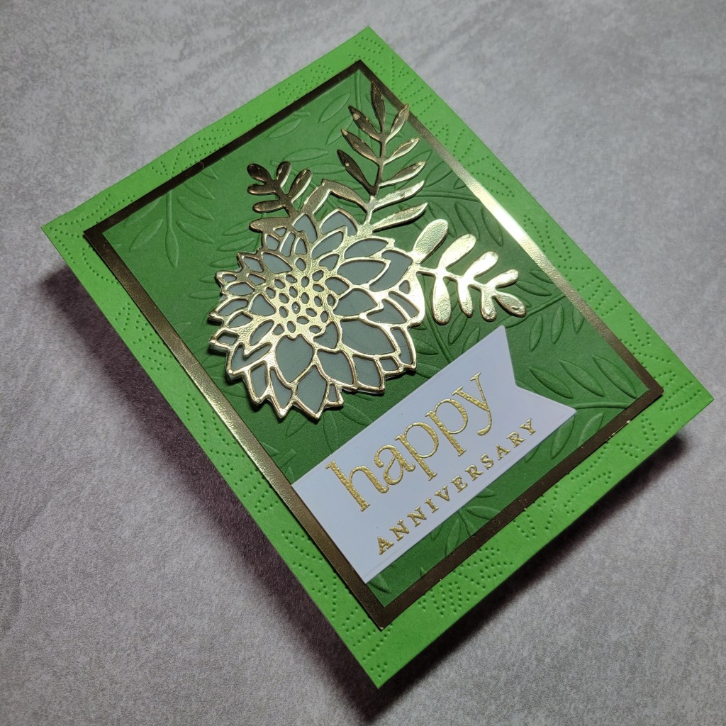
True story: My hubby and I were dating 6 years before we married, and we intentionally got married on the anniversary of our first date so that it’d be easy to remember our anniversary! I’m happy to say that we’ve been together 30 years, and married 24 of that 💓. So of course I had my hubby in mind when making this card…. up til it started to look more feminine that I had planned. *sigh* 🙄 Hubby is a nature loving guy and I knew I had a coordinating cover plate and embossing folder with ferns that would be perfect. I received both Gina Marie Designs products (Fern embossing folder and Pinpoint Fern cover plate) last Christmas and had yet to use either. Now in my head, I also had a matching fern die but alas I didn’t, and that is where this card took a turn. Wanting to make the embossed panel pop off the background, I added a mat in gold foil and when I realized I didn’t have a matching fern die I looked through my stash and found this flower and fern die made by Momenta and I cut it from the same gold foil paper. It felt like the flower needed definition, so I cut a piece of vellum to go behind that part of the die and it did the trick. The sentiment came out of an old Papertrey Ink set called Embroidered Blooms which I gold heat embossed and I used a banner die from Cutter Bee to cut it out. Aside from just feeling rusty, this card came together quickly. I have my bestie to thank for that because for the first time in a very long time we had a crafty date on a video call! We used to spend HOURS scrapbooking and cardmaking together, but life got busy. So glad we carved out some time to craft together!!!
Now, I had another idea for the theme that is… unconventional. Many of you know I use Evernote to inventory my stash, and when I did a search for “anniversary”, a birthday stamp set from Simon Says Stamp called Stop Drop Party came up. What do you think… does this count as an anniversary card??? (Please ignore the crummy heat embossing… this was the 3rd attempt and I gave up trying to get good results.)
This uses a very old, never used embossing folder from Darice called Star Border. It has that embossed rectangle as part of the pattern, and it was the perfect size for the sentiment! I pulled out my metallic Gansai Tambi paints and quickly added color to the raise impressions. The pattern is not quite A2, so I trimmed it to fit the pattern, which left a border on the top and bottom of the card front. I simply used the watercolor paint again to dress up the border. The embossing isn’t clean, the painting isn’t clean… but you know who won’t notice or care? My almost 86 year old father who has questionable vision anyway 😆 He’ll be like, even with my magnifying glass the words are blurry. I need to go back to the eye doctor! 😅 Anyway, I love the rainbow colors! Oh, and I inked the embossed panel in silver ink to match the sentiment and tiny stars. Would have been done in 10 minutes had I not fought with the embossing for an hour 🙄 And yes, I tried to scratch off the errant specs of embossing powder but it either wouldn’t budge or it would tear the paper. I think the embossing powder is just old and not giving good results anymore. Its a Wow! powder but the jar is almost empty and I am pretty sure its gotta be around 12 years old.
Well, that’s it for me, but not for you!!! No, you can hop on to see what the other Squirrels have made for the theme! There’s just a handful of us, so it isn’t a huge time suck. Here is the hop list:
So be sure to head over to the talented Lounon of Craft Me Craft Moi for her interpretation of the theme! You won’t regret it because her blog is just FULL of amazing cards and projects! Most of the Squirrels post a lot more than I do, so consider subbing to them to see all the pretty things they make all month long. With that, I will see you this time next month and hopefully there will be a brisk Fall chill in the air cause I’ve had enough summer already! Thanks for dropping by and I always appreciate when you take time to leave a comment!
Howdy y’all! Welcome to the Christmas in July, Squirrel Style!!! That’s right, this month’s installment is themed Christmas in July and our supply/technique of the month is foiling! If you’ve been here before, you know the drill (and welcome back!!!). But for those of you who are very confused right now (Squirrelz??? Christmas? Theme?), I’ll take a quick moment to explain. My friends and I, affectionately known as the Squirrel Squad, come together every month(ish) and challenge ourselves to use items in our stash that have been neglected. To make it interesting, we pick a theme and then a supply or technique as an additional challenge. We thought foiling would be a perfect fit for a Christmas in July theme and with so many options for foil (Deco foil, hot foil, foiled papers/tape/washi), the possibilities are almost endless. I’m gonna apologize right now for the questionable photography. Shiny things are notoriously difficult to photograph, and I lack the skills to do this justice. I’m sure my Squirrel Sisters are better than I am though, so be sure you hop along to see their beautiful foiled creations! There’s only 5 of us, so it will take no time at all to get your inspiration for the day! Here is the lineup:
OK, ready to be blinded by the shine off of these foiled cards???
Honestly, I struggled for hours to get anywhere, and kept switching ideas because I wasn’t loving anything at first. But the mojo finally started to flow and I was able to complete more than 1 card, so Yay Me! That’s how my brain works when crafting… I go from “this looks terrible, let’s try something else entirely” to “well, maybe I can fix that after all” to “ooh, I got another idea” and in the end I have multiple cards. Thank goodness my brain doesn’t do that with cooking!!! Could you imagine?!? 🤣 OK, let me stop rambling and get into this! First up:
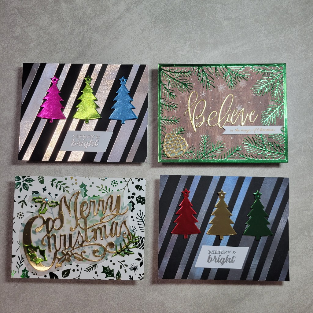
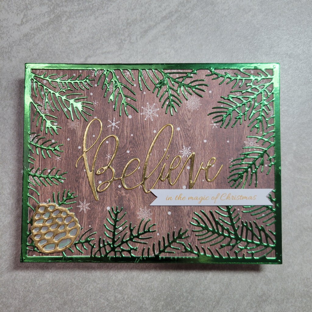
This card is my favorite of the bunch! I knew right away I wanted to use this die from Gina Marie Designs called Pine Needle Frame that I got (appropriately) for Christmas last year. The green foil from Tonic has been in my stash probably 5 years and this was the first sheet used from the pack. I remember getting a great Black Friday deal and buying a bunch of colors, most of which have yet to be used, like this green. The struggle came in finding a background that didn’t compete with this shiny frame (this was where I switched off to another project, in frustration). I finally found this wintery wood paper that allowed the die cut to stand out, without being too bland. The Believe die cut from MFT was cut from a scrap of gold foil, (origin unknown it’s so old), and I was pleased to find it was the perfect fit! I have a literal crap ton (technical term) of Christmas stamps, but can you believe I don’t have one that says “believe in the magic of Christmas”?!? (Mental Note: rectify this immediately.) So, the sub-sentiment banner is computer generated and I really wish it was gold foiled but alas I don’t own a laser printer (2nd Mental Note: Also needs to be rectified ASAP.) so I settled for changing the color of the font. And finally, I found a pine cone die cut that was a magazine freebie, so I die cut it gold and backed it with vellum to help it show better. I really like the touch it adds!
The project I switched off to when frustrated with the 1st above started out only as a plan for a foiled background. I simply cut strips from silver foil and black cardstock and adhered them to a printer paper base to make card assembly easy. I didn’t really have a plan beyond that, but the background would have met the foiling criteria, and from there I could have added any Christmas stamp. But I was so pleased with the foiled die cuts from the first card, that I went digging through the hoard stash and found this Christmas tree die from a budget company called Firefly (a spin off company under the Momenta brand). I’ve had this stamp and die combo set for at least 4 years and never used this die. I used pieces of foil in my scrap stash to cut the tree in a variety of colors, layered them up on extra black die cut trees, stamped and heat embossed a sentiment from the same set, cut it on the same angle as the strips, and before I knew it I had 2 cards ready to go! And honestly, this layout gives me so many ideas for other cards… patterned paper trees, or solid trees on patterned paper, or maybe cut the trees from other specialty paper… oooooh, like flocked paper!!! See?!? You could go really CAS if you leave the background plain, or even vintage with the right papers. If only I had more time!!!
Now, I ended up doing all that die cutting thinking I didn’t have time to actually foil anything. But, I was thinking back to a previous Squirrel challenge hop (linked HERE) where I used Gina K Designs Foil Mates to foil a background. I kinda remembered making more than I needed for that hop, so I went rummaging through my stash of misc backgrounds… and low and behold I found this beauty that used a multi color foil called Emerald Watercolor that has a couple of greens and gold in it! (Triple points for the 1). actual foiling, 2). Christmas theme, and 3). using a background from the mountain of unused project pieces!!!) Still having fun with the foil die cutting, (and an aversion to pulling out the laminator) I grabbed another sentiment die, this one from Spellbinders and cut it from the previously mentioned scrap of gold foil paper. I fussy cut a shadow mat for it from vellum so it would be easier to read on the busy background, yet not cover up too much of it. (It needed something but I didn’t know what so I jumped back to the previous project and made the 2nd card with paper strips and more trees.) I felt like it needed some green to tie into the background more, so I used the same die to cut just the holly leaves of the sentiment die and fussy cut them to overlay. That same magazine freebie die set from the 1st card had a holly leaf and pine sprig, so I cut them from the green foil to add some pizazz. A final touch was adding an iridescent gem to the holly berry. Huzzah! (Mental Note: obtain foil epoxy dots in red and gold since I apparently used all of the ones I had.)
See how easily it is to go from 1 card to 4 without really trying??? Hopefully I didn’t bore you explaining my process! You know what is totally not boring??? The rest of the hop!!! Your next stop is undoubtedly going to be amazing because Lounon is super talented!!! And if you didn’t come here by way of the incredible Marie, make sure you go through the whole hop to see what gorgeousness she (and Anna and V) made! After all, its Marie’s love of Christmas that convinced us to make that this month’s theme!!!
Just a quick note to let you know that the Squirrel Squad is taking a little break, so we’ll be off the rest of the summer and will be back in September to pick up where we left off (God willing and the creek don’t rise). That’s not to say that the girls won’t be posting during that time, so make sure you’re subscribed if you don’t want to miss seeing their beautiful cards and projects!!! Thanks for dropping by!
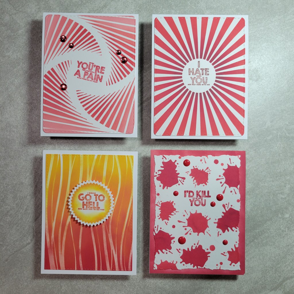
Hello everyone! I was so sad to have missed last month’s Squirrel hop with my dearest crafty friends!!! Life happened, and I’m experiencing a flare in my condition which affects my hands so crafting and typing are more harder right now. So that mean this month will be short and sweet! OK, so you should have arrived here by my sweet friend, V’s blog, Passions and Distractions. By now, you know the drill… monthly hop with theme and challenge of a specific technique or supply. This month our theme is Humor and the supply is stencils. Texture pastes are out of the question for me right now, so ink blending it was! Despite my issues, I managed to make a set of 4 cards!!! Say what??? IKR?!? Take a look:
See? Simple! Same stamp set, similar color palette, same line of inks, same technique… but different stencils, different dies, and a different funny sentiment on each one. The stamp set used is from Lil’ Inker Designs and its called The Fine Print. I didn’t take pics, but on the inside of each card is stamped either “Always Read the Fine Print” or “Read Between the Lines”. Cute, right? Oh wait… maybe you need to see each one closer to understand what I mean. Be sure to read the *whole* sentiment, even if you have to squint to see it! Hehe… first up:
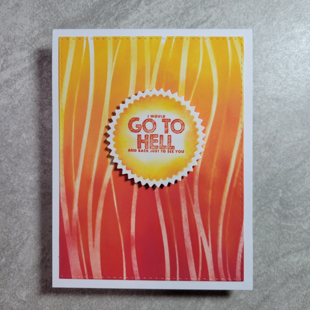
This GO TO HELL card uses a Simon Says Stamp stencil called Waves, and I used it on its side to hopefully resemble flames. LOL A Spellbinders pinking die was used to stencil the focal piece/sentiment. This card makes me smile because my hubby and I have a joke from 30 years back… He was talking to a friend on the phone and I hollered out “tell him I said hi”, to which my husband then told him “Karen said go to hell”. It was so funny at the time that it has “stuck” and we use that whenever one of us will be seeing someone without the other… “Tell so-and-so I said to go to hell!” Next up:
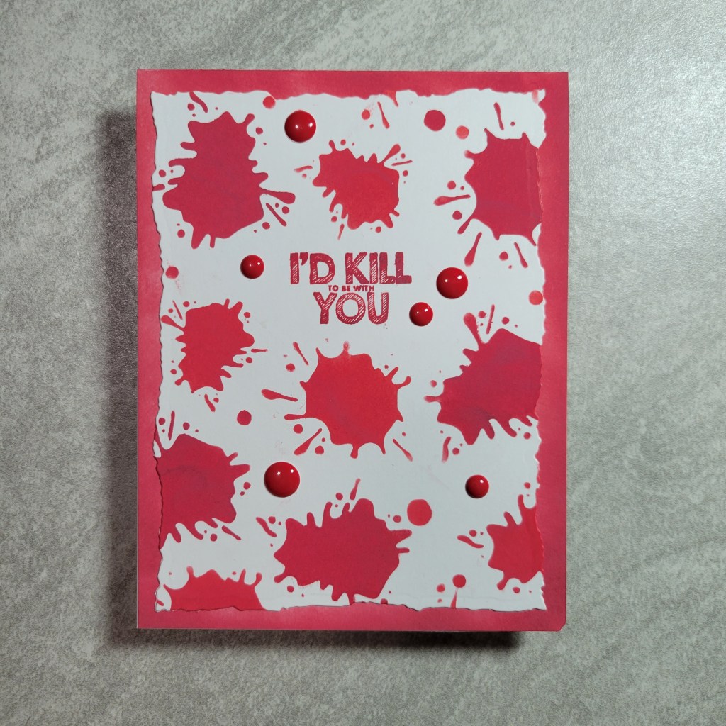
This I’D KILL YOU card was a pain in the ass to make but I love how it turned out! I’m pretty sure Courtney Kreeber never intended the stencil she designed back in the Create and Inkspire days called Ink Splatter to be used in this way. 1 stencil, 1 die, 2 inks, and 6 epoxy dots, and this card was done. Next up:
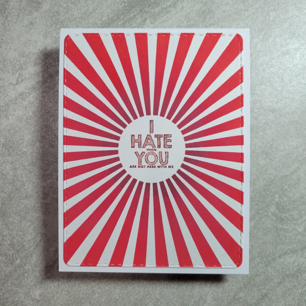
I HATE YOU is made with a My Favorite Things stencil called Radiating Rays with the center being the perfect spot for a sentiment. I thought the rounded rectangle die was a good fit for this card. And finally the last card of the set:
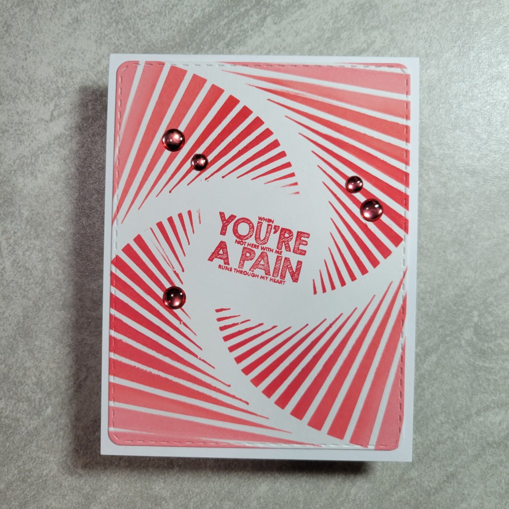
This YOU’RE A PAIN card is just as simple as the previous card. The stencil is from Creative Expressions and has a weird name: That Special Touch – Falling. See? Weird. Anyway, the center was perfect for a sentiment and with the rotation of the design, I couldn’t help but rotate the sentiment for fun as well as adding some matching foil epoxy dots.
I think these cards are funny as hell, but I have a warped sense of humor. You’ll have to let me know if they made you giggle too. There are 2 more sentiment in the set but I ran out of time to use them. These cards were hard enough to pull off! That’s it for me but be sure to hop on to the talented Lounon of Craft Me Craft Moi! She’s sure to have an incredible take on the theme! Thank you for dropping by today and leaving a comment… let me know which card is your fav, or if the sentiments offend you! I originally had a completely different plan for this month, and even started the other cards but ran out of time to make them. You *may* see them eventually if I can get some crafty time on a day when my hands work better! Fussy cutting may be involved…..
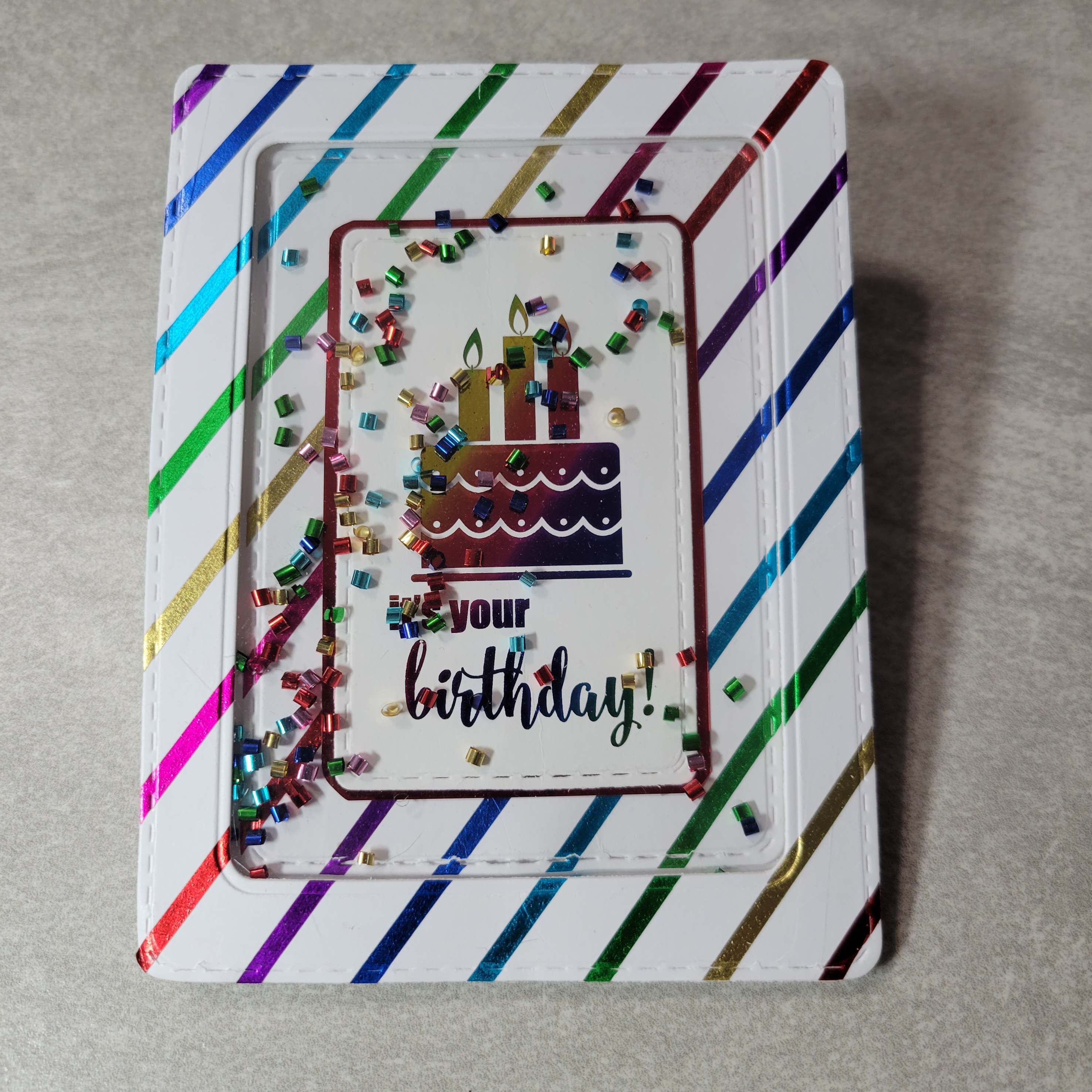
Welcome crafty friends! For those new here visiting from Marie’s amazing blog, I’m glad to have you here and hope you’ll consider subscribing! And for those who have been here before, I thank you for coming back each month to see what the Squirrel Squad have been up to! “The Squirrel Squad?” you say? Yes! We’re a handful of crafty gals who easily get distracted by squirrels and craft supplies… so much so that we have accumulated a hoard, er stash, of supplies that hardly get used before we’re on to the next supply. So we challenged ourselves to pick a new supply or technique each month, along with a theme or prompt, to see how we could use some of those neglected craft goodies! This month’s theme is Birthdays!!! I *love* to make birthday cards! And the technique this month is Interactive Cards, with a side challenge of using foil for extra points! (Not really, but when discussing how much foil we own, a couple of us wanted to challenge ourselves to apply foil (see what I did there?) to this theme as a supply suggestion.) Ok, so before I dazzle you with the shiny, foiled, interactive cards, let me give you the super short line up for this month:
Formalities out of the way, lemme tell ya, this was a tough challenge for me!!! Interactive cards are always HARD for me… I don’t have the patience for fiddly projects. I thought I’d do a shaker card, cause that seemed like the easiest interactive card I could think of at the time. But even shaker cards are such a challenge for me to get everything lined up, keep stuff from sticking where I don’t want it to, keep the static from the acetate under control, etc. These cards look ok in the pictures, but I’m not at all happy with how wonky they are in real life. I ended up with 4 cards to share, but only because I kept messing up and then didn’t want to waste the pieces! Have a look:
From the moment I decided on a shaker card and that I was taking the extra foil challenge (LOL: accidentally typed “fool challenge” which is actually still totally accurate), I knew I wanted to make a card with this toner sheet card front from Gina K Designs. Years (and years) ago I HAD to have these toner sheets… birthday, Christmas, backgrounds… I have a BUNCH. Out of 9 packs I’ve previously only used maybe 4 individual sheets from 2 packs, and this is my first from any of the birthday packs. These 2 came together easier than I thought they would:
To make the shaker card version, I die cut the toner sentiment with an oval die and foiled it, then used a smaller oval die to make the aperture in the card front piece. The shaker bits in all of today’s cards are tiny foil cylinders in rainbow colors, a score from Dollar Tree several years ago. These foil pieces multiply when you use them… you take a pinch out and somehow the container is more full than it was before you opened it! And while they give a fun look, they can be obnoxious little buggers that spring across the room when you just look at them and they leap into any exposed foam tape if you make the mistake of breathing. There was a fair amount of cussing during the making of these cards! LOL However, after getting the card assembled, I had fun coloring clear foil epoxy dots with alcohol markers to match the foil colors. I love how these 2 cards turned out and they are the least wonky of the set. Here are hopefully better pics, but the angles may be unusual because its even harder to take pics of shiny cards than it is to make shaker cards with festive but evil foil shaker bits!
I was able to foil the sentiment (from another GKD pack) in the middle of the Rainbow Shattered Glass foil sheet used for the card front piece, and I couldn’t help but use the negative to make another card (albeit not interactive, but stunning IRL if I do say so myself) using a sheet of full toner paper from Deco Foil.
These next 2 cards started out really fun. I have a set of foil washi tapes from Hobby Lobby that have virtually never been used despite being in the craft room at least 5 years. I was pleasantly surprised to discover that their adhesive was still good as washi is known to have a limited life span. I envisioned a set of 2 cards, 1 black and 1 white, but all the toner sentiments in my GKD packs were on white paper, so I resigned myself to make just the 1 card… until I die cut the sentiment wonky and opted to make another to replace it. But then when I was constructing the card I accidentally used the wonky version. 🤦♀️ So I made another striped card front and decided to play around with the size of the shaker window to make the 2nd card different. All the pieces were die cut with a stitched rounded rectangle die set from Pink and Main. I used the largest die to make a card front and card back, scoring the back piece 1/4″ and using Scor-tape on the flap to attach it to the card front. Sadly, I couldn’t get the shaker parts lined up well, so I ended up having to trim the pieces I die cut for the card base because both are so wonky! See:
Oy! And the static!!! I dusted the acetate with my powder tool and carefully wiped out the extra powder with a microfiber cloth, and still the static was unbelievable! I know the static will fade in time as the paper absorbs humidity from the air, but it was just an extra level of frustration dealing with the foil shaker bits. I will say that I took the time to glue a handful of the foil cylinders so that when the shaker bits finally settle to the bottom, some will always stay where I wanted them. I prefer the version with the larger shaker area better, but the one with the smaller window and larger frame was easier to put together. I like them both despite their wonkiness and would still love to play around with the foil washi on black cardstock sometime. It was actually enjoyable to add the foiled washi stripes using my Misti grid to keep them fairly straight… it was just the shaker aspect that drove me crazy! (Correction: crazier) Anyway, the sentiments were foiled this time with a regular rainbow (not the Shattered Glass) foil from Deco Foil, which totally matched the washi colors in a stoke of luck. Here’s a closer look:
Phew! If you hung in there with me this far, I appreciate you putting up with all my whining! 😄 I’m actually glad to have the chance to play with the foil and laminator, and to use up some of those shaker bits. I really enjoyed foiling the toner pieces and hope they don’t get buried again not to see the light of day for years. And for those of you who are just scanning the pictures (I’m looking at you, Sharon 😉), your next stop on the hop is ever entertaining V Fairchild of Passions and Distractions and I am sure she will inspire you to find ways to make interactive cards with whatever you have in your stash! I know she always inspires me, so make sure you go see what she made, then hop on to Anna and Marie if you haven’t already!
Thank you again for dropping by! Leave me a comment and let me know if shaker bits or making shaker cards make you cuss too! 😅 I greatly appreciate when folks take the time to leave a message so I know I’m not just talking to myself here!!! LOL,,, let’s be real, I talk to myself all the time. Why would this be any different?!? Ha! See you next month for another installment of Squirrelz Stash Bash!
Welcome back, my crafty friends! The Squirrel Squad is back at it again, bringing you another mini hop that will inspire you to bash your stash of supplies!!! For those who haven’t hopped with us before, we are a group of friends who frequently get distracted by squirrels and tend to let our crafty supplies get neglected. In an effort to change that, we decided to have a monthly hop, with a new theme each month. In addition, we’ve designated a supply type each month to encourage us to use supplies we’ve “squirreled away”. This month the theme is Animals and the suggested supply is glitter & texture pastes! Now, we’re a small group so it takes almost no time to hop through and see how each of the Squirrelz interpreted the theme with the supplies they have. If you arrived here after visiting our sweet and spunky Marie, then you are on the right track already! Here are the links for everyone, and there will be another link at the bottom of this post to send you along to the next stop.
Now, this was I challenge I *really* needed. I am embarrassed by how many jars of pastes I own. And what is worse, is that so many of them are not even usable anymore because they dried out. 😥 I had so many ideas for cards, and then I’d pull out the color paste I needed only to find it was hard as a rock or so dry and thick that you couldn’t spread it. That said, I was still able to pull together several cards with the pastes that are still good. And I’m inspired to find ways to use them up so I don’t waste them! With that in mind, I used a bunch of paste this month and made a bunch of cards. Grab a beverage and have a look:
Told you I made a bunch!!! First up, this sweet card using a dog image from Clearly Besotted’s Puppy Love set.
The background was made with a stencil from Gina Marie Designs called Paws and Bones. First I ink blended with Distress Oxides, then used a rose gold pearl paste from Vicki Boutin for the tiniest of the paw prints. It needed something more, so I went over the whole stenciled area with a clear gloss paste from Tessler. I spread more of the rose gold paste on a scrap of paper and let it dry, then die cut a heart from it using a nesting die set from Darice. I liked the texture I got… almost like fabric. The sweet little doggie was colored using Brutfuner pencils. The sentiment is from a set I don’t think I’ve ever used before, Papertrey Ink’s Through the Trees, and I added another paste paw print in the rose gold on the sentiment strip. I know eventually I am going to need this pet sympathy card, but for my Besties’ sake, I hope this card sits in my stash for a very, very long time!!! It’s one of those cards you would rather make in advance than when you’re sad. And yes, I colored the image to match her pup. Next up, a Christmas card:
This one was made with another Gina Marie Designs stencil aptly named Deer. I used a gold glitter paste from BoBunny, which must have been drying out because it was difficult to use. The stenciling has flaws, but I thought it was still pretty enough to use. I wanted red in the color combo, so I die cut a label shape from red glitter paper with a die from a magazine freebie and popped it up on foam tape. I found a stamp/die set from Recollections in my stash that had a reindeer with coordinating die. Like the last card, I spread the glitter paste on a scrap and tried to die cut it. Unlike the pearl paste, the die wouldn’t go through the glitter paste. It even warped my new Magic Mat trying😖. So, I used the stamp and heat embossed it in gold glitter embossing powder from Ranger, then die cut it. The sentiment is from another magazine freebie, which was stamped in red and then die cut. I added some red, glitter, epoxy dots from Gina Marie Designs to finish it off.
This CAS-ish card was made using a stencil from The Crafter’s Workshop called Aspen Trees. I first ink blended with Oxide ink, then used Silver Gem glimmer paste from Nuvo to make the trees look like Birch trees since I don’t know what aspens look like (cause I don’t think they grow where I live). Wait, do Aspen trees look like Birch??? Hold on…. OK, had to check with Mr. Googlepants and I’ll be! Aspen tree trunks look just like Birch. Who’da thunk?!? Doh… squirreled again! Where was I? Oh yeah… the sentiment is also from Papertrey Ink’s Through the Trees (seriously, I should use this set more often!) and then it was die cut with a banner from Creek Bank Creations. The birds are also in the same stamp set, and I just stamped them in red and heat embossed in red glitter embossing powder from Wow!. Next up:
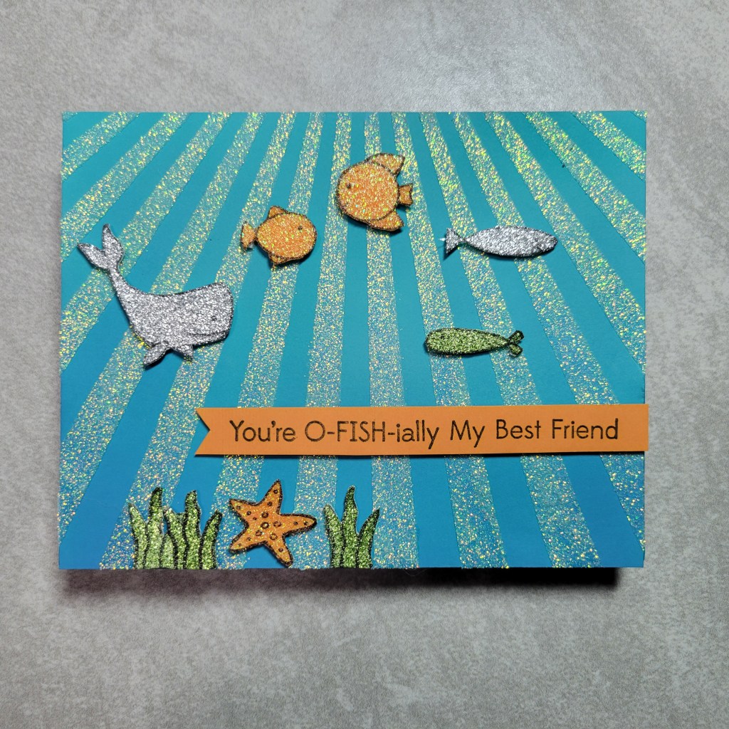
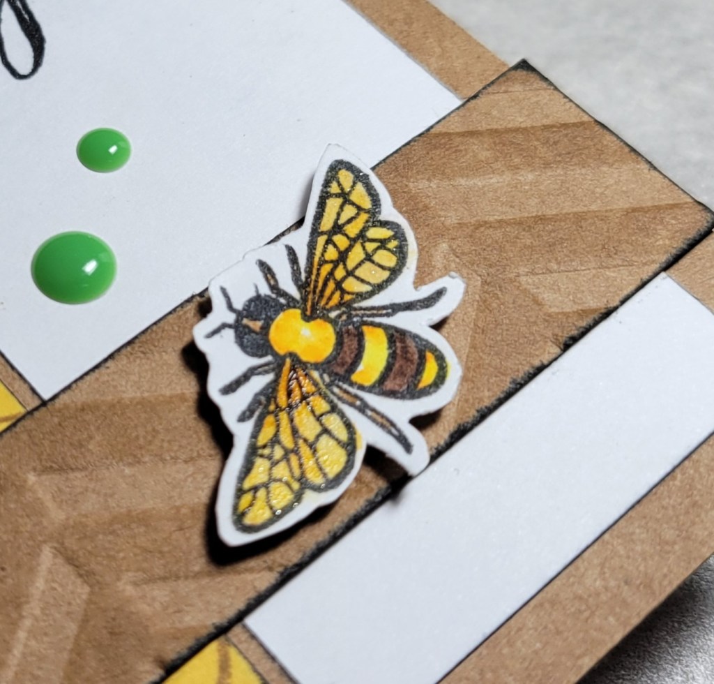
Ok, this one might be my fav, even if its hard to photograph! I first ink blended with Oxide inks on a blue panel to make it darker at the bottom, then used MFT’s Ray of Light stencil with Moonstone glimmer paste from Nuvo. Just like on the first card, I spread various glitter pastes thinly over scrap paper. Once dry, I stamped images from MFT’s Fish You Were Here set, heat set the ink, then fussy cut the images. I decided to use a different set for the sentiment, so I grabbed Beary Best Friend, also from MFT. I just realized this is a full MFT card! Y’all, I don’t normally do time consuming cards, but this one was a labor of love. LOL 😆 But *so* worth it! I swear IRL this card is mesmerizing with all that sparkle and shimmer!!!
This next card is definitely a runner up for fav:
This card really used up my stash! The die cut background, from Impression Obsession, was in a baggie of previously cut die pieces. The ink blended piece for the butterfly was in another baggie, just waiting for its day to get used. I have a stencil and mask combo from Heidi Swap (a real moldy oldie!) called Butterfly set. I decided to use the open butterfly stencil with a 2nd stencil over top, so the stencil design would just be in the shape of the butterfly. I went through my stencils until I found one that worked well, and Hero Arts’ Glorious Petal was perfect! I used the Moonstone glimmer paste again, and once it was dry I carefully cut the butterfly shape out, using the dried paste as a guide. I love how Moonstone reflects the colors underneath! The butterfly already covers so much of the background that I didn’t want a big sentiment. I die cut a scalloped Spellbinders oval die and inked the edges with the colors from the butterfly and then got the idea to ink blend the sentiment to match. I used a Stampendous set called Brushed Wishes for the sentiment and I love how it turned out. This is one of those cards that looks even better IRL than it does in pics.
Phew! That was a lot so I thank you for sticking with me!!! This is one time when I honestly feel really good for using my stash because I had quite a few pastes that needed to be used up before they became pretty concrete. 😄 I had shown the Squirrel Squad a pic of my almost overflowing drawer of pastes, so I don’t think I could’ve gotten away with making only 1 card, so I hope you don’t mind the long post.
And, I am stoked to have used supplies from a *bunch* of different companies too. I had to go back and count. Wanna guess how many??? 22 different companies! Insane right?!? THIS, my friends, is why I no longer do DT work. I was free to use *anything* in my stash and look at how much I was able to use! Impressive… until you look at the condition of my craft room. You’ll have to use your imagination because I am *not* taking a picture of that mess! Ok, now its time for you to head over to my dear friend V’s blog, Passions and Distractions to see what she came up with. I’m headed there too, cause I always love both her projects *and* her writing!
Thank you for stopping by today, and say hi to V for me, will ya?!? Ha! If you haven’t been to her blog before, I can tell you that you’ll love her! You know this girl “squirrels” a lot when she even names her blog “distractions”! She’s my kind of gal!!! OK, off with ya! Oh and we’d love if you leave comments along the way so we know we’re not just talking to ourselves, and subscribe if you want to see more from us. 🤣 Have a great day… and go use those pastes before they become concrete!!!
PS: I know someone is going to point out that this was an animal theme and I neglected to make a squirrel card (especially considering I got several new sets for Christmas). All I can say is that my plans were thwarted when I found out my chocolate brown glitter paste was absolutely solid. By the time I came up with a backup idea, I had run out of time. It was a missed opportunity, for sure!
Welcome back to another installment of Squirrelz Stash Bash. And not just any installment, but the first of 2023!!! We’re all getting a little bit busier these days, so to make things more doable we’re making a teeny tiny change. If you came here from my sweet friend Anna’s amazing blog, I’m so glad to have you here! And if you are already a follower, I’m so thankful to see you again!!! If you are new here, the Squirrelz Stash Bash is a small monthly hop where my friends and I, a.k.a. the Squirrel Squad, make cards based on a monthly theme with the goal of using supplies we’ve been “squirreling away” and have neglected. In years past, our monthly prompts had 2 components: a required theme and a randomly selected supply type or technique. Having to combine both was sometimes very challenging. Several of my talented squirrel sisters are doing design work for companies these days, so to free them up we’re making a slight change. The monthly prompt will still be a required theme, but the randomly selected supply / technique will now be optional. To kick off the new year, the prompt for January is Love / Friendship and the suggested technique this time is ink blending.
Before I get ahead of myself, let me share the hop list with you. There’s just a handful of us, so it makes it easy to see all the interpretations of the monthly prompts! I’m sure the girls will wow you with their talent, like always!
Ok, so although the technique is optional, my silly brain went all in on the ink blending and almost forgot to incorporate the actual theme. Ever have a time where your brain is just so insistent on something that it neglects to consider other alternatives? I kinda knew I wanted to use a new to me stamp set I received for Christmas (Hero Arts Little Buddy) before it was squirreled away and forgotten about. Have a look at how my cards turned out:
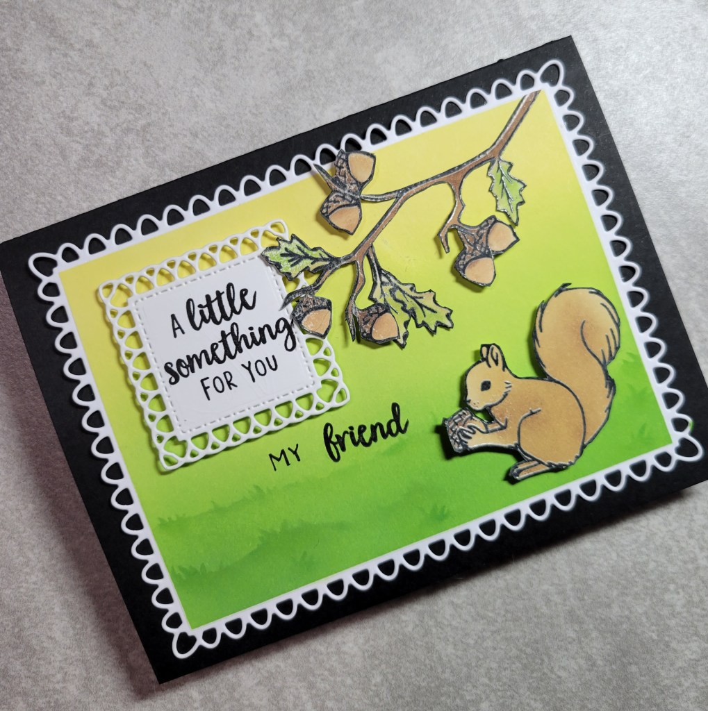
I say I went all in on the ink blending because I immediately had the idea to ink blend both a background, but to use the ink blending as a way of coloring too. I started by stamping the images and heat embossed them, knowing I would be ink blending to color them with Distress Oxides. I used a handful of browns for the squirrels, acorns, and branches, blending until I was happy. I used new to me dies from Gina Marie Designs for the panel layer and sentiment layer. I applied masking tape to protect the edges of the panel, and then used another handful of Oxides in pretty colors to create the backgrounds directly on the panel, blending the inks with makeup brushes. I used grass slimline stencils from Stamp Anniething to ink blend some details on both panels. I wiped all the extra ink from the images, expecting the heat embossing to show through with its glossy finish, which it did not, which surprised me! It was not a showstopper though, and the embossing still provided a raised line to assist in fussy cutting. The squirrels were easy to snip out, but we will not talk about how long it took to cut out those oak branches! Assembly came together easily with parts of the branch glued flat to the panel and the acorns being popped up on foam tape for dimension, as was the sentiment. Here is a closer look at each card:
Don’t look too closely at these cards because they have more than a few flaws. In fact, you’d swear these cards were actively trying to thwart their own creation. Crafting only once a month is making me rusty and I made multiple rookie mistakes and wasted valuable time. I tell you this so that if you too have days where you make more garbage than projects, you are not alone! I have misplaced my mojo many times, but I always find it again… eventually!
Time to hop on over to my good friend Lounon’s blog, Craft Me Craft Moi, where there is no lack of mojo or talent! I’m heading there myself as I’m excited to see what she, and the others, have made this time!!! Thank you so much for visiting!
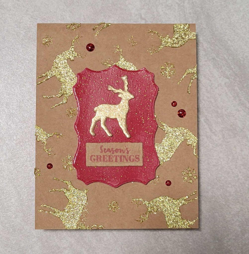
Welcome back, my crafty friends and fellow craft supply hoarders, er… I mean collectors! Today’s monthly installment is brought to you by the Squirrel Squad, back with our little hop that we put together to make sure we’re using the supplies we have ‘squirreled away’ 😉 As December is crazy busy, we decided to make this month’s theme a little easier on ourselves by making the theme Christmas / New Year’s. As you know, along with the theme we usually pick a specific supply or technique to use. Again, this was not the month for any of us to struggle with a potentially challenging technique, so we decided we could each use our favorite technique! So this month you will see even more variety and inspiration than usual in our projects!!! I didn’t even think that was possible, but here we are, killing it! Who is “we” you ask? Here is the short lineup:
What was that you asked? “So Karen, what *IS* your favorite technique?” Oh, I’m glad you asked! I really struggled to pick just one, to tell you the truth. I love masking… seeing the results is always like opening a Christmas present, right? But my first thought was actually CAS cards (but is that a technique or a style?!?). But then, there is ink blending… and colored pencil coloring… and… Well, you see I just couldn’t limit myself to only one technique! Not only that, I couldn’t limit myself to just one card. I did, however, limit myself to just 1 stamp set. Have a look:
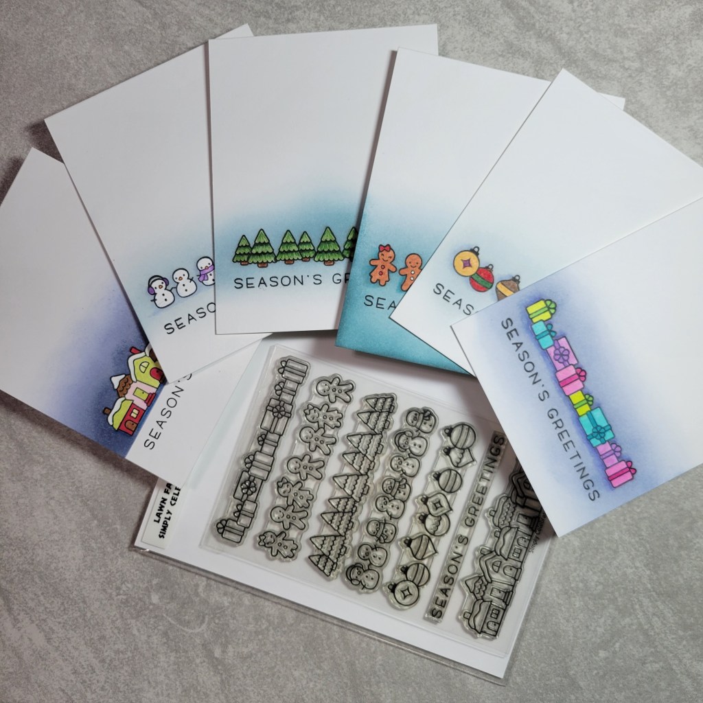
Perhaps this is a better view:
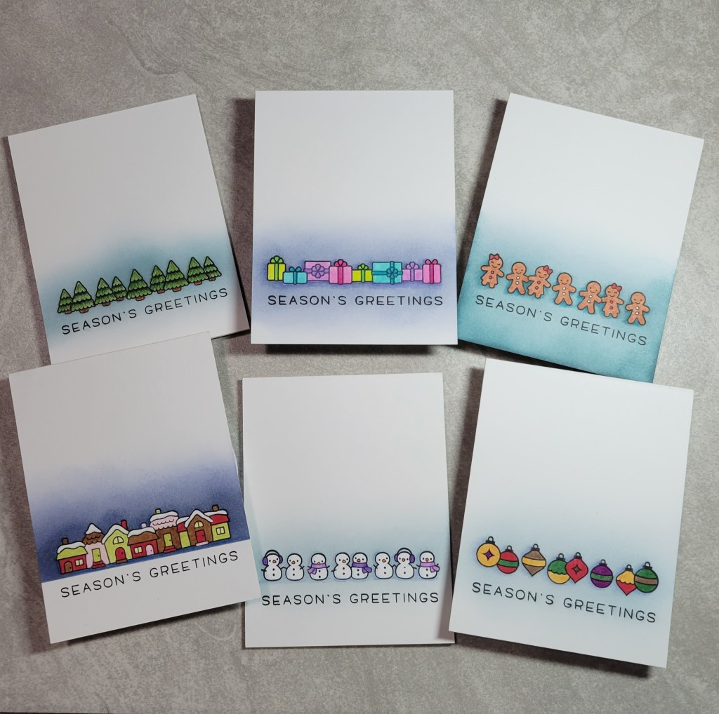
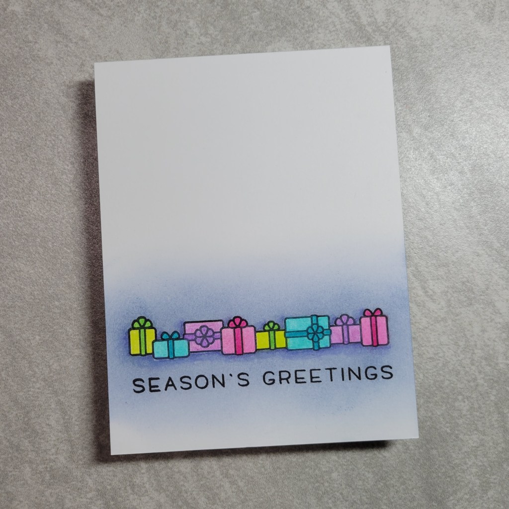
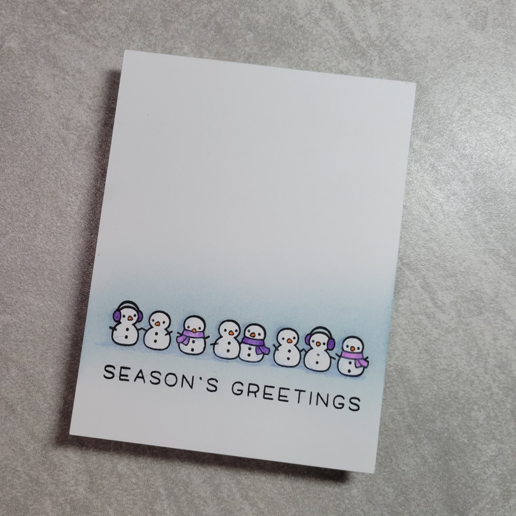
Yes, you are seeing that right…. 6… 6 cards. Same technique(s), same stamp set. So to make things simple, I’ll give a brief description here and then show individual, close up card pics. The stamp set I used is Lawn Fawn’s Simply Celebrate, and I used Every.Single.Stamp. in the set. It has only one sentiment, but it paired nicely with each of the 6 border-like stamps. After stamping each of the 6 images on card fronts, I made masks and (painstakingly) fussy cut each mask and lined them up with the images. I did not mask the arms pf the snowmen or the loops of the ornaments, cause ain’t nobody got patience for that. In the case of the winter village scene, I also masked off a ground, that in hindsight should have been made to look like snow, but 20/20 and all that… 🤦♀️
All 6 cards were ink blended with various types of ink (picked solely based on color preference, not brand or type). And then after the masks were removed, all 6 were colored with Prismacolor pencils. I kept it simple with virtually no shading as the images are small and I was going for, well… simple. So, let’s review:
CAS? Check
Masking? Check
Pencil coloring? Check
Christmas/New Year’s theme? Check
Sweet, mail friendly cards? Check!!!
Now, in no particular order are close ups of each card. Don’t forget to hop on to the next stop on the short and sweet hop to V Fairchild of Passions and Distractions. She is sure to inspire you with her craftiness, and her amazing writing style will entertain you in the process!!!
Well, that might have been the least I’ve ever said in a blog post! (You’re welcome, but don’t get used to it!!! 😄
Now, don’t forget to head over to V’s little corner of the internet to see what her favorite technique is! I thank you all for dropping by and leaving a comment if you have the time!!! Tell me what techniques are your go-to’s! Or a technique you avoid like a pandemic. 🤣 For me, layered stamps. Doesn’t stop me from buying them though! 🤦♀️
Hope you have the Happiest and Craftiest of New Year’s!!!!!
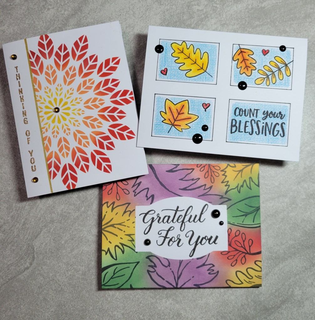
Welcome back my stash bashing friends! I’m happy to be hopping with the Squirrel Squad again, using those supplies we’ve “squirreled away”! Per the usual, we have a monthly theme and for November its Leaves! To level it up, we also give ourselves an additional guideline which is either a specific supply or a technique. This month we are all Masking (which can really be so many techniques within that guideline) and using Leaves. Sounds like fun, right? Before we get into the details, here is a hop list in case you get lost. There’s only a few of us so it doesn’t take long to skip through 6 posts! (And I’d like to take a minute to welcome Bory back after a few months off 😊. We missed you, sweetie!) And if you are here from Bory’s blog, welcome!!!
Now I have to admit that I struggled a bit initially to come up with an idea because (once again) I was thinking too literally and couldn’t come up with anything interesting. Once I finally got my head wrapped around it though, the ideas kept coming! Have a look at the cards I made:
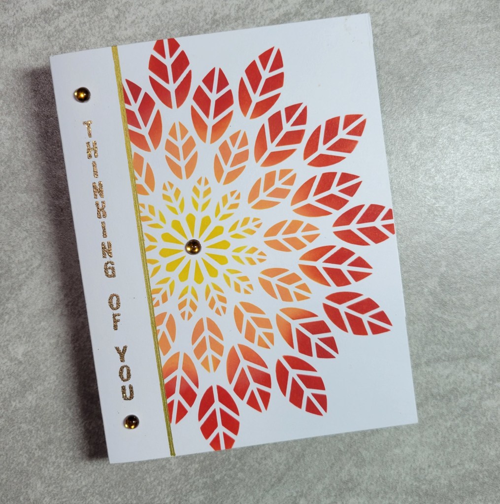
I started off with an easy CAS card using Altenew’s Leaf Burst stencil. I masked off an inch on the left side of the card and ink blended my stencil with three Distress Oxides. Once I removed the stencil and masking paper, I decided I wanted a line to define to two sections. I used a Signo gold gel pen and a ruler to add a line alongside the inking. Then I stamped a sentiment from The Stamps of Life called Stand Up 4 Sentiments because I wanted my sentiment to be vertical in the masked area. I heat embossed it in Ranger glitter gold embossing powder, and added a trio of moldy-oldie embellishments I picked up at a Scrapbook Expo more than 10 years ago (my how time flies!). Quick and easy! Take a look:
Next up, I had the idea to mask off a sentiment area with a label shape from Spellbinders (this one was an exclusive through Scrapmart, from way back in the day) and stamp a background over it. I used a Cover A Card background from Impression Obsession called Sketched Leaves. With the mask still on, I used Distress Oxides to ink blend around the card front, making sure to have good coverage around the edges of the mask to give it definition. Once complete, I removed the mask and stamped a sentiment from another oldie-moldy stamp set, this one from Kelly Creates called Traceable Celebration (intended to teach brush lettering). Here’s how it came out:
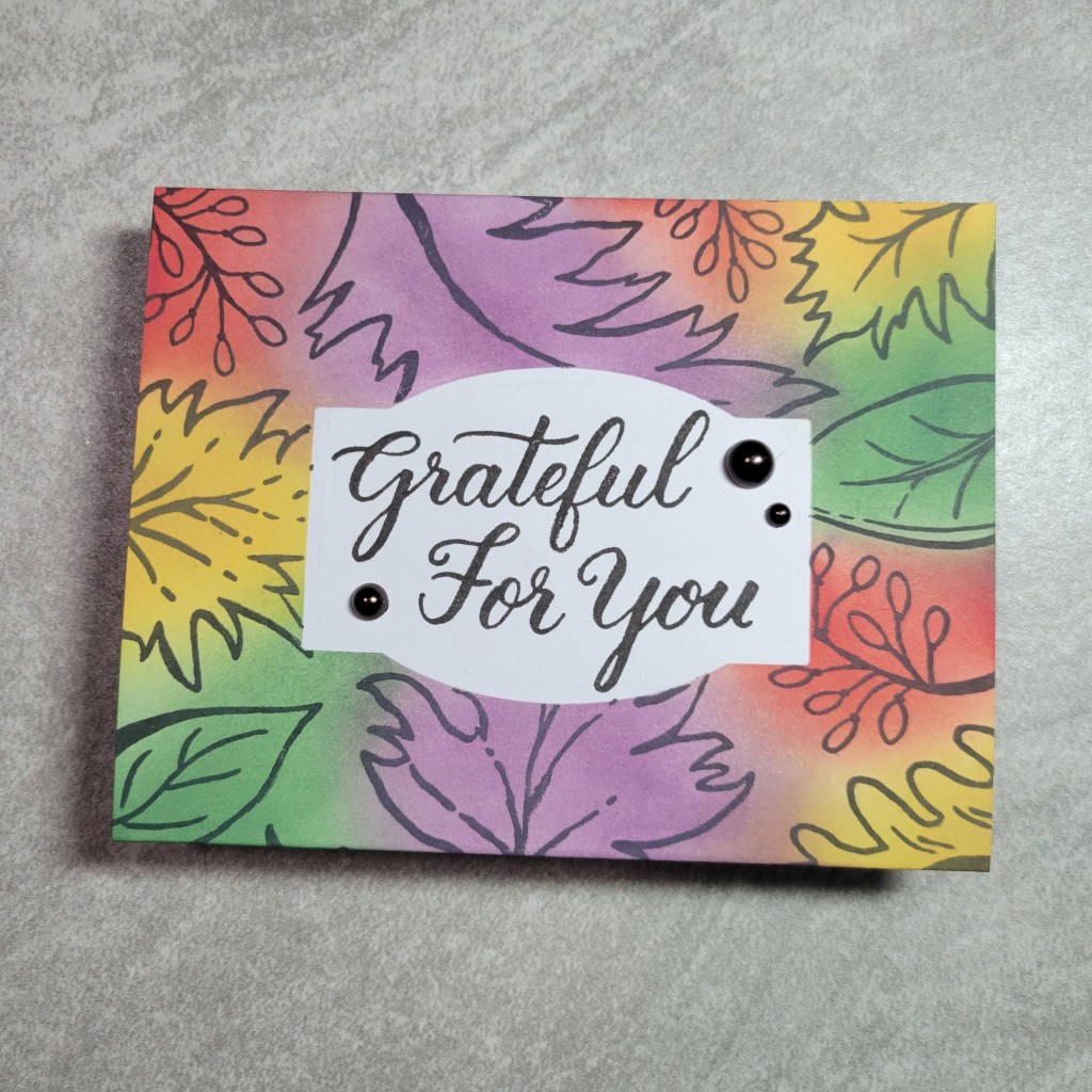
The concept of double masking is what inspired this next card. I used MFT’s Window Panes stencil and lined it up on my panel to mask off everything outside the 4 windows. I then placed the leaf and sentiment stamps from Jane’s Doodles Thankful set within three of the panels and a sentiment from Jane’s Doodles Hello Fall set in the fourth window. Using masks of the images, I then stamped MFT’s Linen background in Distress Oxide ink over the masked images and through the stencil. Because the stencil is so thick, the background wouldn’t stamp right up to the window opening, so I basically got a bonus masking because its like I masked the inside of the windows too. Before removing the stencil, I outlined each window with a black Micron pen. After peeling back the masks, I colored the leaves with Brutfuner colored pencils and I added some black epoxy dots as embellishment. I love the crisp feel this card has! Have a look:
I just realized a few things… 1. All three cards would have been considered one layer had it not been for the embellishments, and 2. I’m a dork (actually, I already knew *that* part) and stamped the sentiment on the label card upside down. 🤦♀️ Now I’ll have to cut the panel off and stick it on another card base before mailing. Oy! All things considered, it could be worse! And, 3. That stencil on that last card was wonky. *sigh* Despite being crooked, its still my favorite!
That’s it for me. A quick trio of cards that came together in just a couple hours. Like usual, once I pushed through that initial struggle for ideas, I could make cards for days with the ideas that flowed making these! Alas, I am out of time… but with a tote of supplies on my desk, I *might* just carve out time to follow through with a couple more “masking with leaves” ideas!
Before you run off with ideas of your own for a card with masking, take just a couple minutes to hop on to the sweet and funny Lounon Riviere of Craft Me, Craft Moi. I have no doubt she has outdone herself, which is saying something because everything she makes is worthy of framing and saving forever! She never fails to wow me with her talent!
I thank you so much for stopping by! I’d love it if you left me a comment while you are here!
Everyone’s favorite day of the month is back again! Today is the day the Squirrel Squad shares our take on the month’s prompt, while intentionally using supplies we have squirreled away and perhaps forgotten about! Before I get ahead of myself, here is the lineup this month:
In case you ever wondered, the themes/prompts are randomly selected from a list we generated at the end of last year. Some months it is a supply prompt, and other months it is a technique prompt, along with a theme. October’s theme and prompt is Vintage and Embellishments (the more unusual the embellishment the better!) and initially I was terrified. See, vintage is so not my thing and I didn’t think I had *anything* in my stash that would work. Then I actually started looking at my stamps and realized I could actually make vintage-y cards for days with stuff I had and forgotten about! 😄 Some supplies I picked up in mystery boxes, others in consignment sales or destash lots. Others would work if applied creatively to the theme. I made 3 projects for you but I think I could have made a dozen if I had only started sooner! Have a look at the cards:
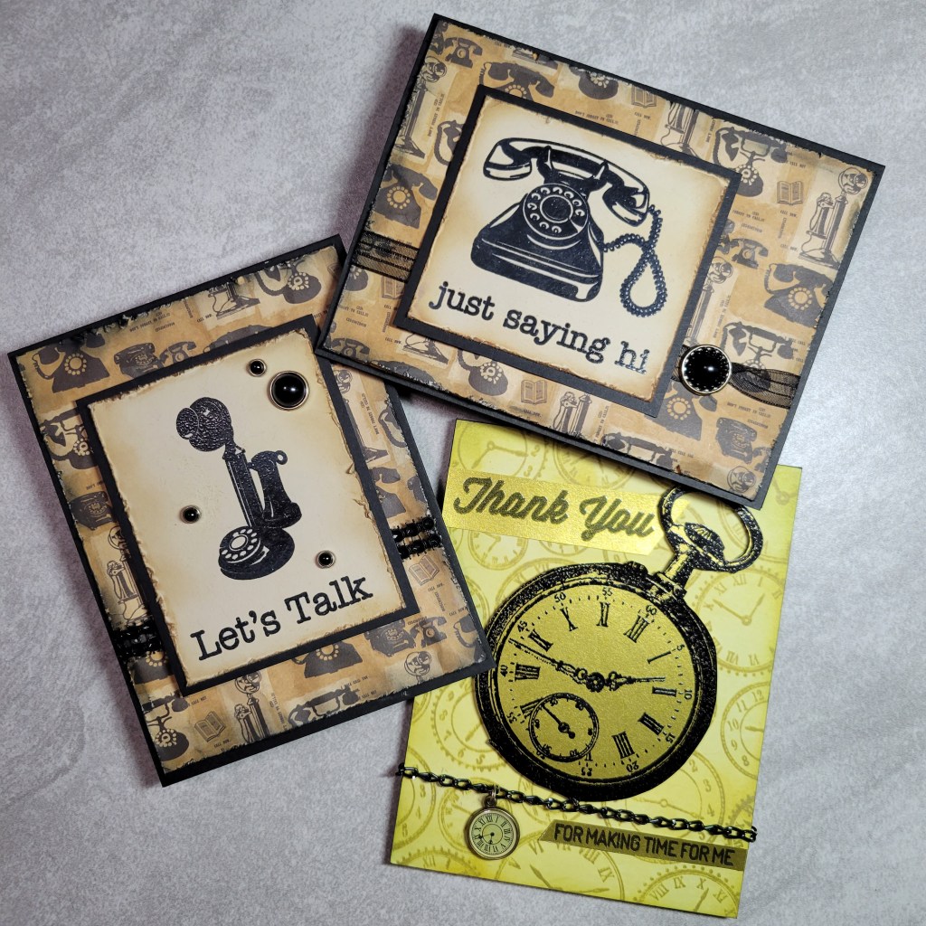
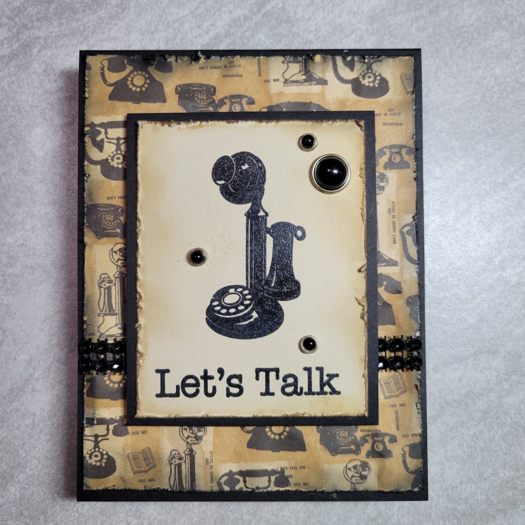
When I dug through my stash the first stamp set I found was a Hero Arts set called Just Saying Hi with the vintage telephones. It immediately reminded me of patterned paper I have with similar phones, which I knew would look extra vintage if I distressed it with scissors along the edge, crumpled it up to make it wrinkly, and then used inks to dirty it up. Let’s take a closer look at the first one:
Distressed, vintage paper, check. Vintage image, check (heat embossed, even!). Embellishments? I knew I had some fun brads that would work great for the theme. I picked these because they also kinda looked like old time electronics buttons (to me, anyway!), and then I found this weird cloth like rhinestone-y stuff I bought thinking I would eventually find a use for it. I have a sheet with about 50 rows and have now only 48 more to go! LOL 🤣 It doesn’t show well in pics, but the circles are like concave rhinestones, which also looked buttons like to me. (Maybe I just have a button obsession… which is funny because I actually *do* have more buttons than I could ever use in my natural life span, and I didn’t think to use any on this theme 🤦♀️). Let’s take a look at the second card made from the same stamp set:
This checked all the same boxes, but this time I decided to use some ancient organza ribbon with an ornate button-like brad. I gathered the ribbon up between the clasps of the brad for a little flair. SIDE NOTE: I should add that all the metal on the embellishments of these two cards started out shiny, new silver which just looked wrong on the distressed backgrounds. I painstakingly colored the silver with a copper Sharpie which dulled it down to a muted gold. Its one of those things that no one knows you did it, but they would certainly notice if you had not! You know, like most housework. Next time you visit someone at their house, tell them how clean their baseboards look. I don’t know but my baseboards only get cleaned when I know company is coming! Ha ha!!!
OK, and now for something really different, take a look at the final card:
I am not going to lie to you and say this card is prettier IRL, but I will swear on my dead body that it does color coordinate better IRL. 😅 I spent WAY too much time on this card not to include it. This one morphed through 6 different shades of gold trying to match that (f#!&ing) adorable clock charm that has such a unique greenish bronze color! What I finally ended on is a ink color called Green Ochre, which really ought to be called Puke Green. *sigh*
Card details: the stamp set was a $1 deal by Forever in Time, (back when the traveling stamp shows actually had $1 deals) called Timepieces. The background is a Hero Arts stamp with the cutest name, Time to Stamp! The sentiments come from a MFT set called For the Boys. The pocket watch and sentiments are heat embossed on gold(ish) glimmer paper. I picked up a handful of these clock charms from a Scrapbook Expo show at least 10 years ago, and the chain is an even older purchase from when I thought I might enjoy jewelry making (SPOILER ALERT: I do NOT. Shame I didn’t figure that out before I bought All.The.Things. #stupidlyboughtitallbeforeeventryingit) I think I have 20 linear feet of this chain and I have now used it exactly twice for a grand total of maybe 10 inches. 🙄 Despite disliking the final card (only for its puke color), I had fun making it and I love the layout! If only that dang charm had been silver!!!
I now have a collection of other random vintage-y supplies on my desk to be put away: antique car images, keys and locks, typewriter keys and paper, camera stuff, light bulbs, old time hand tools, and random sewing themed supplies. See what I mean about how I had things that could be used on a vintage theme without actually buying them for that purpose?!? I am also thinking a floral image with patterned paper with a tiny flower, 1950ish wallpaper look would maybe work too!
OK, so now its time (pun on that last card!) to hop to the next Squirrel, which is the amazing Anna Mahtani, who I promise you would never make a card that looks like vomit. 😉 Like you, I can’t wait to see how everyone interpreted the theme and what they used for embellishments! Be sure to hop along with me to see all the vintage goodness. With only 5 of us this month, it won’t take long to click through and leave some love for these ladies who have exercised their creative muscles to make something beautiful for this month’s prompt.
Howdy y’all and welcome! I’m thrilled to have you along for this month’s Squirrelz Stash Bash, were my friends and I, aka the Squirrel Squad, use the monthly prompts to use supplies we’ve squirreled away and perhaps neglected. We have a fun prompt for you this month… and I am betting you have not seen this one elsewhere! Ready for it? (drumroll…. ) Rainbows and Rodents!!! LOL! 🤣 Yes, you read that right! And no, we were not intoxicated when we came up with the idea! (Well, at least not all of us. 😉) You might think there aren’t that many ways to combine these 2 seemingly random ideas, but I guarantee you will see 5 of them if you hop along me with me and the other Squirrels! And I’m betting at least 1 of those will be a very creative idea… which was actually the inspiration for my card. Before I explain how, let me give you the hop lineup:
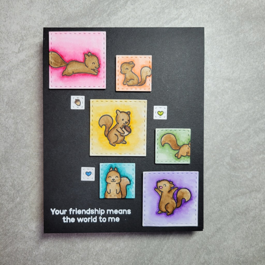
So back to my inspiration… I’m usually very literal in my thought process, and admire Anna and the others for being more creative with able to think “outside the box”. So I thought if I’m more of a “inside the box” crafter, why not take *that* literally as well. Have a look to see what I mean:
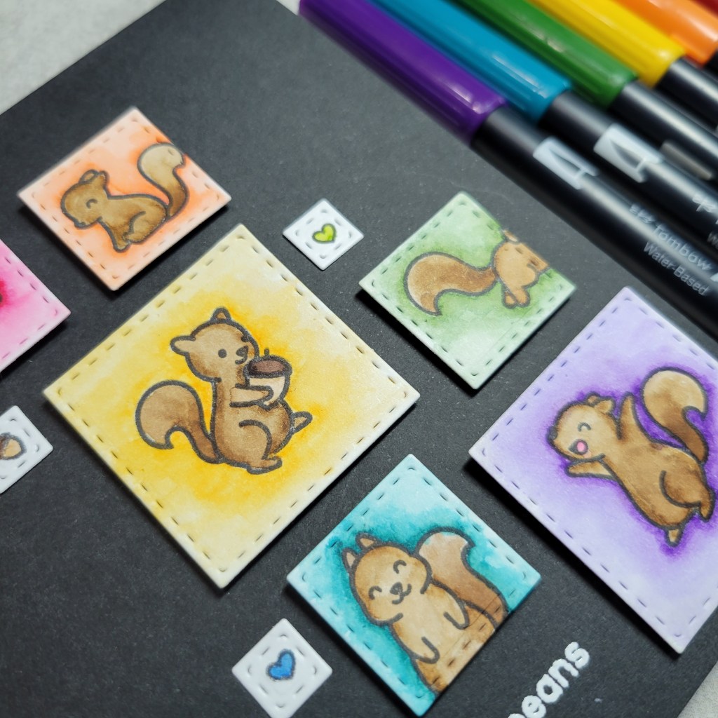
Get it? My rodents/squirrels are all in squares or boxes! I knew I wouldn’t have time to create some elaborate scene, so I took this box idea and tried to make a CAS, rainbowy, rodent card with stuff in my stash. This squirrel set from Lawn Fawn, called Let’s Go Nuts, has only seen ink once before. Ironically it was for another hop with these same lovely ladies back in October 2020, which you can see here. This card has a completely different vibe even though I tried to use fall-ish versions of my rainbow colors. For this card, I die cut each squirrel into a stitched square (using Simon Says Stamp stitched dies). Then each square was watercolored using Tombow markers. I came up with a layout I liked, then had to find a sentiment to fit the layout. I wanted a friendship theme, so I was fortunate to find this sentiment in a Jane’s Doodles set called Girlfriends (which needs to see ink sometime soon too!). I heat embossed the sentiment in white and added a couple smaller images to bring in another aspect of white.
To be honest, I had intended the squares to either have a white edge or white mat, but spacing didn’t really allow the mats, and my skill level didn’t allow the edge. Ha! I glued everything down before I thought to splatter white paint, and white epoxy dots seemed to clash with all the squares. My brain tells me I need another white element, but I am unwilling to mess it up with gel pen or splatter, and my mojo is too rusty to think of another way to incorporate white. Doh! I just realized I could have white heat embossed on the edges of the squares 🤦♀️ *sigh* Maybe next time! Well, that’s all for me… a relatively quick, CAS card… and a peek inside my creative process, or lack thereof! But never fear, because the rest of the Squirrel Squad is far more creative than I and they are going to wow you with their Rainbow Rodents! (Now there is a sentence I never thought I would ever type! 😄)
If you are a regular subscriber, I thank you so very much for your support. And if this is your first time here, I really appreciate you hopping here from V’s amazing blog, Passions and Distractions. Don’t forget, there are only 5 of us hopping this month so take just a few minutes to check out all the rainbowy goodness the Squirrel Squad has for you today!
And to my dear fellow Squirrels, this card is for ALL of you!!! Truly, your friendship means the world to me!!!!!!! Mwah! 😘 😘😘
Y’all, life got crazy for most of the Squirrel Squad, so we opted to take a few months off from posting, but we were excitedly discussing the possibilities for when we reconvened and I’m happy to announce that we are hopping today! To remind you, we have monthly themes and the goal is to make a project for the theme that uses supplies we have “squirreled away”. 😉 For August, the monthly prompt is Summer/Vacation. As you might recall, we also include either a specific supply or a technique we must use. That is my favorite part of our little (there is just 6 of us) collaboration… I love seeing the personality of each of us revealed in the way we interpret the theme using supplies from our stash, many of which tend to be old, retired, or simply forgotten about. It’s the perfect occasion to use those items we just had to have… and then never used once we got it in our stash. Before we take a look at my project, here is the hop list so you can see how all the Squirrels interpreted the theme:
This card uses so many things I had to have… most coveted of all is the Clustered Leaves die from Simon Says Stamp. I wanted this thing so bad for so long and finally broke down in 2020 during a Simon brand sale… and then I did nothing with it. And the flower? Another Simon exclusive die called Cosmos Stem, this one bought in 2019, also never used. I used Wild Honey Oxide ink over yellow cardstock to achieve the variant in color on the flower. The background die called Lattice Frame, which was bought from Tessler Crafts at a stamp show also back in 2019, has been through the die cutter only once prior to this card. You might remember it here in a project I did for the now defunct Create and Inkspire. I had this already die cut panel in a baggie of backgrounds waiting for its turn, so its like a double win that the die has been neglected *and* I used up an extra die cut piece! I thought about using some kind of fancy paper or finish for the lattice, but the plain white on white allows the floral die cuts to shine while adding interest in the background. I struggled big time with the sentiment. The only “summer” sentiment I had was this one from Jane’s Doodles Summer Icons. But “Hello Summer” isn’t really a card I would actually send. And y’all… my brain kept insisting that I use a Simon Says Stamp since I was using all their products (yeah, forgot that background die wasn’t theirs 🤦♀️). So I dug through my Simon stash and found this “Missing You” sentiment in their Some Bunny set. Now let me rationalize why I’m using it here in a summer/vacation theme. See, my bestie and I used to see each other every summer, twice in fact. In June I’d go stay a week with her and in July she’d come stay a week with us. That hasn’t happened in quite awhile, and I miss those days, and her, so much! So its a little summer and a little vacation, but not exactly. Which is how my brain works… not exactly. 🤣 Here’s the same card with my preferred sentiment:
Tell me in the comments below if you have ever actually mailed a “Hello Summer” card! Heck, I’m lucky if any of my cards ever see an envelope, much less get mailed. But this one should make its way to central Florida… providing I can find where I hid my stamps. That’s it for me this month, but you still have 4 other stops to make to see what my sweet friends have packed in their summer suitcase for you!
Dang! The blog got a little dusty, didn’t it?!? Well, this world sometimes throws things at you that are of higher importance than crafting and hops, so you just have to respect that and try to adjust. Right? But we’re back now and full of crafty ideas. For those who have no idea what all this hop business I’m talking about is, my crafty friends and I (affectionately known as the Squirrel Squad) are on a mission to bash the stuff in our stash… you know, use all the things we’ve squirreled away and neglected. We usually have a monthly theme and then challenge ourselves to use either a specific supply or a technique we don’t do often enough. This month we are just focusing on the technique… CASE’ing. Before I explain further and share my card, I want to give you the full hop list so you don’t get lost… though with only 6 of us, you should be able to hoppity-hop through faster than a bunny!
This month our theme is to CASE (Copy And Selectively Edit *or* Copy And Share Everything) another crafter in the Squirrel Squad. Basically you pick a card to CASE and use it as your inspiration to make a card of your own. It was decided that I would be CASE’ing sweet Lounon of Craft Me, Craft Moi. I could select any of her amazing cards to CASE, but that was super intimidating because she creates SO many spectacular scene cards with Copic backgrounds and *that* is definitely not one of my skills. I selected a fairly CAS card she created recently for LDRS. Have a look at her card:
Gorgeous, right? Thankfully Lounon occasionally makes cards that aren’t Copic scenes! When I saw this card, I thought I could easily work with the sketch, and use one of the many floral stamps I own. From there, I put my own spin on the card trying to keep the inspiration obvious. Here is my take:
As you can see, I stuck closely to the sketch. Since I broke from the almost monochromatic color scheme Lounon used, I added a thin mat as I felt I need a little contrast to separate the yellow focal panel from the white background. My floral image is from Jane’s Doodles Daisies set, as is the cute bee. I watercolored the images with Tombow markers, a medium I am more comfortable with than alcohol markers. Now, I gotta be honest and tell you I tried to no-line color the images like Lounon did, but *that too* is not a skill I have and I reverted to the safety of line images. The pattern on the yellow rectangle is a CAC (Cover A Card) background stamp from Impression Obsession called Flower Garden. For the strip, I opted to dry emboss mine instead of stamping like Lounon had done. The sentiment, chosen for its bold and scripty look to match Lounon’s card, is from MFT’s Brushstroke Expressions. I did stamp surgery to separate the words to arrange them in 2 lines vs 1 to suit my needs, but I cut it so that it will piece back together easily to use as it was intended. (Side note: I will never buy another brushstroke sentiment again as it always looks like I got a bad stamping from it!)
I don’t have many stitched dies, and none in the sizes I wanted, so I didn’t add stitched details to the layers like Lounon, but instead I inked the edges to help define them. And since I varied from the color scheme she used, I opted to add a sprinkling of epoxy dots to add even more color. To finish it off, the images were popped up on foam tape and the wings and eyes of the bees were shimmered with Wink of Stella. Why, oh why, is it so hard to photograph shimmer and glitter?!?
I was seriously intimidated to CASE my dear friend Lounon as she is beyond talented. I tell her often that it is just a matter of time before she is “craft famous” and I mean it with all my heart. (To be honest, CASE’ing *any* of the Squirrel Squad would be intimidating because each is so talented in their own ways!) While it is obvious that I used Lounon’s card for inspiration, it is equally obvious that she is a far more gifted artist. That said, I was fairly pleased with how my card came out, especially considering I’ve been on a crafting sabbatical for 2 months *and* that I haven’t used watercolor markers in over a year! I feel incredibly rusty and I don’t like that, but I don’t see a way to change that much for the time being. But I am ever so thankful that my Squirrel Sisters motivate me to craft at least once a month!
Thank you so much for dropping by and taking a couple minutes to visit the rest of the Squirrel Squad! I’m eager to hop along myself to see what cards they picked to CASE and how they put their own spin on them. There is so much talent in this little group… don’t miss out!
Welcome back to everyone’s favorite time of the month, the Squirrelz Stash Bash hop where we break out those supplies we’ve had squirreled away forever and use them to create a project for the monthly theme. March is Spring in the northern hemisphere, so Spring was chosen as this month’s theme, to be interpreted as we each see fit 😉 Now, if you have been with us before you know there is also a technique or supply required for the project and this month it is “On the Edge” stamping or die cutting… also to be interpreted as we see fit, so I expect you will see quite the range of cards this month in our little hop! But I can assure you the rest of the Squirrel Squad will inspire you to bash some of those supplies in your stash too!!! If you are here from the amazing Anna Mahtani’s blog, I welcome you! And if you are already a subscriber, I thank you for sticking around!!! Here’s the full lineup for today’s hop:
Now, y’all know how I have to work on multiple projects at a time, right?!? Many never make the cut to be posted and this month was no exception. My trash can is full of failed attempts, but I managed to pull together a few of my ideas as I bounced back and forth between projects. Let’s take a look:
Let’s start off with my fav:
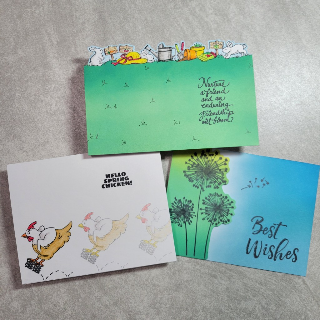
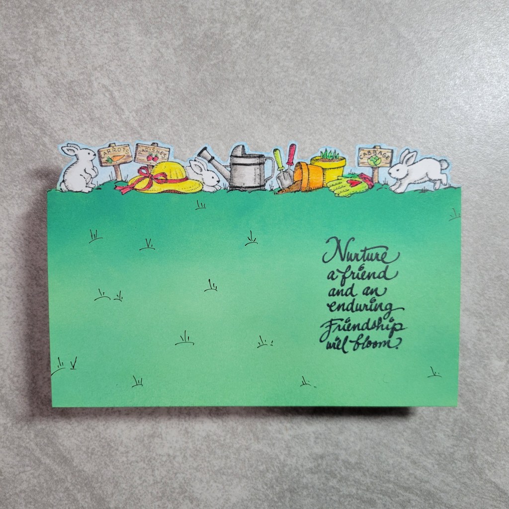
This card uses a golden oldie stamp from a 1996 release by Stampin’ Up! called Best Borders. This sweet garden image is 1 of 4 in the set. Since I started gardening a few years ago, Spring has meant its time to get out and play in the dirt, so this image was appropriate for how I have been spending my non-crafty time!!! I started by stamping the image on the top of the paper and fussy cutting the top of the image. Then I stamped again on masking paper and created a mask so I could ink blend Distress Oxide inks under the image. I heat set the ink and stamped the sentiment, from a set from Stampendous called Thoughtful Wishes. To finish off the card I colored the sweet image with Brutfuner pencils and added some additional grass lines to fill some of the open space. I mounted the card panel onto a top folding card base so the image extends above the fold by almost an inch. I really like how this came out and it was my first time using this set after having it sooooooo many years!
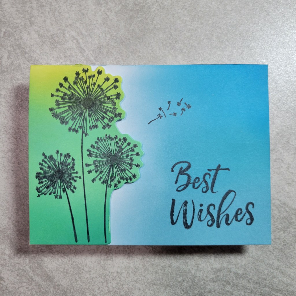
This card almost didn’t make the cut. The stamping is not up to my normal standards, but the idea was too good not to show. I used a set called Dandelions from Crafters Companion that I had in my stash for at least 5 years now without using. I really wish I had used it when I first got it because it stamps very poorly, and I would have taken it back to get a replacement if I had known. Now its retired and no longer available so I’m stuck with it. What is very cool about the set is that it comes with dies to cut both the left and right side of the image, so you could do just one side or both if you want to cut it out completely. I used the die for the right side and placed it on my card front where I wanted the image and ran it through. Then I ink blended the blank card front and inside panel that would be seen from the outside. I heat set the Distress Oxide inks, then stamped the dandelions and the sentiment, which is from a Hampton Arts set called Layer Words. I thought it was a great fit for a dandelion card. In your part of the world, do kids make wishes and blow on dandelions like we used to when I was young? For a final touch I added the the dandelion seeds blowing in the wind. Here is another look at it open so you can see how you could write a message in it:
By the way, did you know that dandelion plants are not only edible but nutritious and delicious? It makes me wonder who ever decided it was a “weed”! Think of all the kids with their manicured lawns that will never get to wish on a dandelion. *sigh* OH! And, the entire plant has medicinal uses!!! I’ll be growing them intentionally this year as a treat for my bunnies 🐰 and an occasional salad green. And if any of my neighbors every make me angry I will just sit in my front yard blowing my “wishes” all over the street! LOL
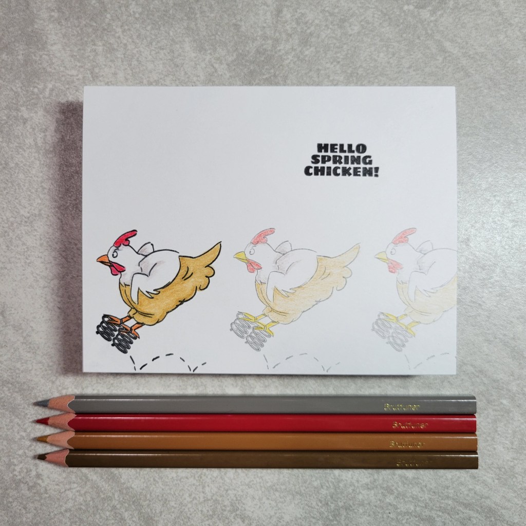
OK, last up is my cheeky “Spring” card! When I brainstorm for card ideas, I rely heavily on Evernote, a program I use for my crafty inventory. The program allows you to search for products by key words, so when I searched for spring, this set was included in my options. And as soon as I saw it I knew how I could stamp along the edge! With 2nd and 3rd generation stamping I was able to make it look like this little chick was moving her way across the card. Once again I colored the images with Brutfuner pencils, coloring the main image like I normally would, and then using the same colors with less pressure for the other images to obtain the time lapse look. The fun sentiment is from the same set, Spring Chicken by Art Impressions. I like how this 1 layer CAS card turned out, even if it was pushing the envelope on the theme a little! 😉😉
That’s it for me, but there is so much inspiration just ahead! Next up is oh so talented Bory Yankova of Bory’s Crafting Place!!! With only 6 stops on this hop, I hope you will continue on and see how we all interpreted this month’s theme! Thanks for dropping by my little home on the internet and leaving me a comment!
Welcome to this month’s installment of the Squirrely Stash Bash! What’s that, you ask? Its the monthly get together of the Squirrel Squad (6 good crafty friends) who use a monthly prompt to bash our stash of supplies that we’ve hoarded squirreled away! If you are here from my sweet Squirrel Sister, Marie Bingaman, I thank you for following along and I hope you’ll subscribe while you’re here! And if you are already subscribed, well you are awesome!!! 😁
This month’s prompt is Botanical using this beautiful photo prompt created by our very own talented squirrel, Anna Mahtani… along with a peek at my projects:
This gorgeous photo prompt was so inspiring to work with! I loved the color combo so much!!! Hopefully you can see the photo prompt as the inspiration for all of my projects. Ok, before we take a closer look at the cards, here is the lineup of Squirrels so you don’t get lost along the way:
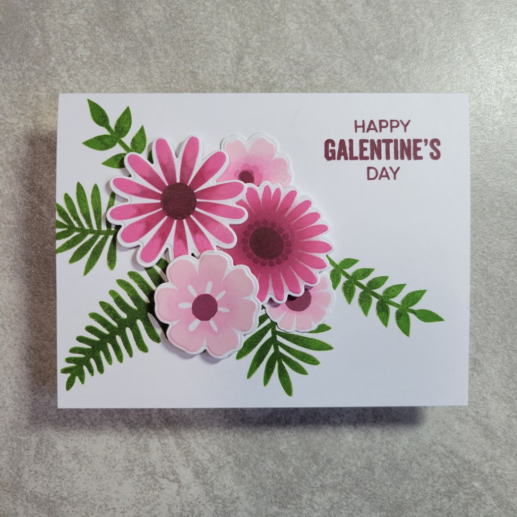
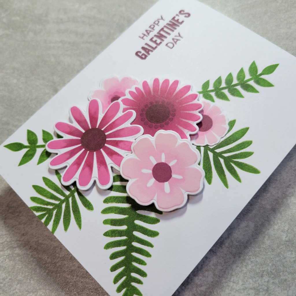
This card was made with My Favorite Thing’s Large Desert Bouquet, a stamp set I’ve had for years and years but *never* used! 😞 I even have the coordinating dies, and for some reason the set was always too intimidating to use! Well I decided it was time to get over that! I used a combo of inks from Impression Obsession and Simon Says Stamp to give a gradient color to the petals and ferns. I was tempted to ink blend some of the bright blue in the photo reference but I chickened out! The sentiment is from another MFT set, this one called My Galentine. The flowers are popped up at different heights:
Next up is an idea I had that was a bit out of the box:
This card was created with a set from Kelly Creates aptly called Mandala, which I thought resembled a flower. This set was also virgin polymer and I am excited to revisit this set as I have more ideas on how to use it. I used a new to me set of square barreled colored pencils from Brutfuner, which I really like. It was nice to bust them out as I’ve only tried them a couple times since I got them. Just as soft and creamy as Prismacolor and yet so much cheaper! The image was a bit painstaking to color (#somanytinyspaces) but was totally worth it and I love the CAS design. The sentiment is from an Altenew set called Dearest Friends, which needs more ink itself.
Last up is a Pocket Slimline, invented by my dear Squirrel Sister, V Fairchild (read more HERE or watch her explain it in a corresponding YT video HERE):
This card was created with a mini set from Altenew called Lingonberry Branch, which was gifted me to by a sweet Sister Squirrel recently. I was eager to put it to use for this month’s prompt!!! I stamped it right on my Pocket Slimline card base and colored it with the same Brutfuner pencils. I have a gift to mail out soon to my bestie, and this will be the perfect note card to include with it! We have been missing each other a lot recently and I hope the gift is something will cause the recipient to think of me every time she uses it, and to smile. I can’t wait to hear about her reaction to a very unusual gift!!!
Well, that’s it for me but not for you! There is still so much more to see, so please hop along to the next of the Squirrel Squad, Virginia who will delight and entertain you! While you are there, check out her recent posts on her new 3×1 challenge for the year, inspired by yours truly!
Thanks for stopping by and playing along with our fun! I hope to be back soon with a post on how I played along with V’s 3×1 challenge!!! Until then, get out those supplies and bash your own stash!!!
Welcome faithful followers and newbies alike! If you are here from Bory’s blog, I sincerely thank you for clicking through to the next stop! The busy holiday season is behind us, and the Squirrel Sisters were feeling a desire to freshen things up with our previous Squirrels Gone Nutz collaborative hop. We all still wanted to make sure we were inspiring ourselves and others to use crafty stash products that we had “squirreled” away, but we thought it would be fun to switch up the types of monthly prompts used to do it. And to give it a fresh feel we updated the name, and sweet Anna made us a great new graphic! So, you ask, what is this month’s prompt? We’re using a sketch for the *first* time as part of the hop!!! This one is from a retired Paper Play Sketches and it is #21, an oldie but goodie. And to further challenge ourselves, we are making all of the cards Friendship or Love themed! Here is a quick look at the sketch we used:
Before I share my projects, let me share the hop list with you:
As per the usual, I had no mojo until practically the *last* minute, then once I started stamping, I had more ideas than I did time. Here’s what I was able to put together in a frazzled all-nighter of crafting:
Yeah, I know… I did it again, and I swear I didn’t mean to! But since I only craft about once or twice a month, I needed to just let the mojo flow!!! I’m not gonna bore you with too many details, but let’s take a closer look, shall we? This first card is my fav, made with Clearly Besotted Puppy Love, a set I’ve had for more than a year and this is the first time its getting inked up:
I used a paw print from the set as the embellishment on the sketch, which I rotated for this card, and the strip behind the 3 adorable puppies is a scrap that is from my scrap bin. I rounded the corners of the rectangular elements to coordinate with the scrap of patterned paper. All the stamps and the sentiment are from the same set, and this card was very quick to design but long to color with pencils! But I *love* how it came out… especially since we just got a new puppy this week! And while he doesn’t look quite like these puppies, it still pleased me to color these while he snuggled next to me!!! Well, until Oliver (the new pup) tried to eat my colored pencils. LOL! I trimmed the panel for a little white to show on the top and bottom of the panel to tie in with the white focal images and sentiment. This card just makes me happy! Next up, a crafty friendship card:
This one uses an older than dirt Pink and Main set aptly named Crafty. Same idea and orientation as the last one, but I used a tiny sequin stamp in the set with a pale pink ink to make a tone on tone pattern in the background. And of course since I used the sequin stamp, I had to use sequins for the embellishments too. The scrap used on this card was from a masculine valentine’s card from probably 8 years ago and I love that chevron! Because it was so busy though, I inked the edges of the focal image panels to finish it off. And because this stamp set has so many fun images, I decided to whip up another quick card with it:
This last friendship card uses a printed paper from an old (and now defunct) Inkspired monthly kit. I knew I wanted to use the paint tubes and paintbrush in the set, and I immediately remembered this paper which looked like paint strokes to me. In no time I had the images colored up, and to add some contrast to the rainbow colors I matted all the elements and the panel in black and used black epoxy dots for the embellishments. I liked the idea of placing the sentiment in one of the rectangular elements for something different! And you’ll notice I didn’t rotate the sketch this time; this one was the literal translation of the sketch.
I would have loved to make a 4th card, using die cuts for the rectangular elements of the sketch. Or do a squirrel card and use acorn images as the embellishment element!!! I think there is so much room for interpretation of the sketch. I’m sure my crafty friends are going to show you a bunch of those ways and awe you with their crafty talents! Be sure to hop on to the uber talented Lounon of Craft Me, Craft Moi.
Welcome back to the monthly shindig of the Squirrel Squad! For those new here, my little group (just 6 of us) create projects using items in our stash that we have squirreled away and not used, or at least not in a long while. Each month we have a prompt that includes a theme and either a technique or supply that needs to be used in our project. For November, our theme is Holidays and our must use supply is Vellum. There are so many ways to combine these 2 ideas, so I’m sure the Squirrels will have a bunch of great projects to show you! Since there is just a few of us it won’t take much time to hop along and see all the amazing ways to add vellum to your holiday cards! Here is the short hop list in case you get lost:
I made multiple cards and *still* had more ideas that I just didn’t have time to explore. I have many holiday products, but I opted to just use stamps from my favorite stamp company, Jane’s Doodles. Now, let me share a little something about Jane. I happened to be the winner of a blog prize a few months ago, but due to health issues this year with multiple family members, I hadn’t promptly claimed my prize. She was SO sweet, she not only honored the prize weeks later but sent me the sweetest care package along with it, and the kindest note wishing my whole family the best and a full recovery! Jane’s Doodles has some of the cutest critter images and beautiful floral sets, and at reasonable prices. And on top of that, the owner is amazingly kind. In a time when the world still seems to be falling apart, its so unbelievable to find a company owner that cares about its customers like this! OK, this fan girl will get on with the post now. 😉 Let’s get a look at my first card:
I am crazy about poinsettias at Christmas time, and especially poinsettia stamp sets. This card uses images from the Jane’s Doodles set Winter Florals, which I bought ages ago and haven’t had a chance to use. The images were heat embossed in white on vellum and then fussy cut. For the panel, I started with a blue cardstock and used Distress Oxide inks to darken the edge and create a vignette. The sentiment is from another Jane’s Doodles set called Merry Christmas, also never used before, which was heat embossed directly on the panel. I added some white embossed snow splatters in the background and added some Pink & Main mirrored enameled dots that have been discontinued I’ve had them so long! The images are glued flat to the card and the adhesive hidden behind the embossing. I just love how this came out! Now, this next card almost didn’t make this post:
When I finished this card I was so happy with it… *until* I realized I had forgotten to include vellum! 🤦♀️ Yes, its true… the images and sentiment from Jane’s Doodles Deck the Halls set were all stamped and heat embossed in gold directly on the card panel. I guess that’s what happens when you just get lost in playing with paper! When I mentioned to some of the Squirrel Sisters what I had done, Anna quickly suggested that there must be a way to add vellum after the fact. I slept on it and then came up with this… the middle ornament has been stamped on vellum with the same gold embossing powder, then alternating stripes were colored with a Marvy gold paint marker, and the adhesive was hidden behind the colored parts. And just like that, my favorite card of the bunch made the post! My next card is more CAS:
Now at first glance you might think the poinsettia is the same as on my first card. However, this one is from yet another hoarded JD set called Christmas Blessings. (I told you I have a thing with poinsettia stamps!) The image is again stamped and heat embossed on vellum, but then I inked the image with Oxide inks on the back of the vellum for a soft colored effect on the front. The sentiment from the same set was heat embossed direct on the panel, and the whole thing was matted with gold foil paper from Rinea. I added some bling from a company called Forever in Time that has been in my stash since… well, forever in time! LOL!!! 🤣 OK, last one:
I used another Jane’s Doodles set called Holiday Sweets for a completely different way to incorporate vellum. After stamping and coloring the images with Prismacolors on the card panel, I cut a fishtail banner from vellum as an overlay. It wraps over the top of the panel and is also secured with decorative ribbon. I stamped off another image and the coordinating sentiment and added them, as well as some candy like epoxy dots to the banner to finish it off. I swear I worked longer on the bow than the stamping and coloring combined! 😄 I remember now why I don’t use ribbon more often!
That’s it for me, but the fun continues on the hop… head on over to the blog of my sweet friend, Bory Yankova, who has no doubt found a glorious way to use vellum on her card! I always love to see Bory’s take on the monthly prompts! In fact, all the Squirrels amaze me with their creativity and talent!!! Thanks for stopping by!
The Squirrel Squad is at it again! Our monthly hops are all about using old supplies we’ve squirreled away and forgotten about. Each month we pick either a supply or technique, and a prompt to go with it. For October, we’re doing the Galaxy technique (typically for making backgrounds), and the prompt is Celebrations. Now, I’m not gonna lie… I was initially stumped and couldn’t figure out how I was going to use the galaxy backgrounds. Like, for weeks. But as usual, once I started playing the ideas just started flowing. That said, I made 3 nearly identical cards so you won’t get to see all those cool ideas that were bursting in my head! LOL ***BUT*** that’s the beauty of this being a HOP! I’m confident that my dear friends and fellow crafters came up with a bunch of creative ways to use the galaxy technique on their cards!!! Here is the full lineup, which is totally doable since its just 6 of us! I’m kicking it off this month so be sure to hop to the next stop which is amazing Anna Mahtani!
First let’s talk about the technique. While there are several ways to do it, I chose to ink blend a rainbow of Distress Oxide colors on the cardstock, not making any attempt to blend or get smooth coverage. Then I used Black Soot Distress Oxide to smudge up the whole panel covering the places that I missed or that had blended into a muddy mess. Now at that point it still looks like a hot mess, but I pushed on knowing the final step will make that mess resemble space. I put a dab of bright white acrylic paint on my craft mat and watered it down just a wee bit. Then with a paintbrush I splattered it all over the panel… aaaaand most of my desk and maybe a little of the floor, too. Ha! And I even used a splatter box to try to contain the mess but I splattered with abandon until I was happy with the panels. I’m pretty sure there is paint on my overhead lamp too! But the more you splatter, the better it looks though… and with 3 panels, I splattered A LOT! Take a look at my set of cards:
See? Nearly identical with the use of vellum and white embossing powder, and yet each is a different celebration theme and uses different stamp sets and bling! Coincidentally all the stamp sets used were from My Favorite Things, but it was not intentional on my part… just happened to work out that way. And each set had only been used once and then left to collect dust so I’m happy to get more than 1 use out of them. OK, let’s take a closer look, shall we? First up is my favorite of the trio:
This birthday card will be going to my son’s friend who has been like an adopted child to me for the last 8 years. This space themed card is right up his alley as he plays several video games that are space related. The stamp set used is MFT’s Level Up, which is all video game related. While it has shiny elements, its not exactly “bling”. I used a couple sizes of silver stars purchased forever ago from Oriental Trading Company back in my scrapbooking days, and also a few Ice Rink sequins from Pink & Main (sadly no longer available on their website) that I hoped looked like planets. This card is my favorite because it has some areas where the colors blended to create another color, and while the card will be hand delivered I preferred the mostly flat embellishments for a masculine version of a galaxy card.
OK, next up is an Anniversary card:
This card uses MFT’s Stars Above stamp set and tiny diamonds from Queen & Co that I think are meant to be shaker elements but they became dimensional stars on this card! I stamped and embossed the star elements on vellum and fussy cut them out and I was able to use liquid glue to attach them by putting it where the embossing powder is the thickest at the points where the lines meet. Same on the sentiment, which worked better than I expected. This card is definitely *not* mail friendly but that’s OK since it will be hand delivered to my hubby! The photo above doesn’t show how sparkly the diamonds are in real life. Indulge me in another view that shows you just how dimensional these really are:
See? Tiny in diameter but totally 3D and pointy! I love how they pick up the color from underneath them!
And now for my 3rd card in the trio… for which I am cheating on the “Celebration” theme. *snicker* In celebration of Friendship Day (yes, I know it has already passed and no one celebrate it anyway) I made this card for my Bestie, but it also seemed fitting to share this here with some of the best crafty friends a girl could ask for, the fellow card makers in this hop group! Y’all don’t know how much this little group of ours makes me happy!!! If it weren’t for my peeps I think I would have sealed up the craft room for a creative hiatus, and yet every month when I sit down to make the projects for this hop I am so thankful that I made the time for me to be creative. I wouldn’t have taken that time for myself had it not been for these ladies, and for that I am so grateful! OK, after that lengthy introduction, let me share card #3:
This card uses MFT’s Anything But Basic Friendship stamp set. I don’t have the coordinating “friend” die so after stamping and embossing I fussy cut the word out. The dark, iridescent sequins are a mix from Walmart and like all shiny things, they don’t photograph well but they are a translucent gray with an iridescent, shimmery sheen that is gorgeous in real life!
All through this creative process I was feeling a strong sense of deja vu. Then in uploading the pics into this post I realized I’ve made a similar yet different card like this before… and not so long along. Guess I am losing my mind that I didn’t realize it sooner! If you would like yet another MFT galaxy card idea, click here to see my shaker card version using the Stars Above set 😁 Honestly, the only other galaxy card I remembered making was this one using a set from Jane’s Doodles using the To The Moon set. I’m so glad this wasn’t an identical copy of a previous card!!! I’m thinking I better see my doctor for a dementia screening! 😆 Had I not been unintentionally CASE’ing myself (LOL) I might have maybe been able to experiment with some of the other ideas I had!!! 🤦♀️ I came up with a Halloween idea and a Christmas idea, and a way to use cute cartoony space themed stamps. Someone please remind me of those ideas for the next time we have a galaxy challenge!!! Because *I’m* clearly not likely to remember them! HA!
OK, I know I rambled on there quite a bit (like usual), but don’t forget this is a hop and there are 5 other stops with much more talented crafters than myself for you to be inspired by!!! Next on the hop is Anna Mahtani who will likely have an amazing tutorial for you and a creative spin on the galaxy technique!!! I always love her take on our monthly prompts!
Be sure to hop along and either leave some love in the comments and/or click to subscribe to these incredible ladies so you don’t miss any of their creative goodness!!! Thanks for stopping by today! Mwah!